November 2018
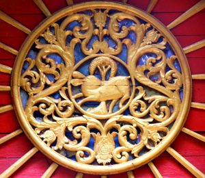 Chiang Mai has so many temples the mind fairly boggles at their number and the frequency with which one encounters them while going about town. This plethora is especially true of the Old City, where everybody ends up going but mostly backpackers and old hippies are more likely to stay, it seems. I usually stay in the Huay Keaw/Nimmanheiman area, a modern area to the west of the Old City. There are plenty of temples outside the Old City — foremost among them Wat Lok Molee with its fantastic teakwood filigrees, Wat Suan Dok with its array of white stupas and Wat Umong, which has a long history on display. And let us not forget the loveliness that is Wat Ched Yod, about which I’ve written a separate post (here).
The temples of the Old City include, of course, the main tourist attractions as far as temples go. In my experience, however, some of the less well-known temples have even more to offer aesthetically than the old standbys, some of which are half in ruins. I’ve gone around the Old City many times during my visits to Chiang Mai and my camera has been busy all the while. In this post I’d like simply to offer a view of some of the stunning details I’ve seen in Old City temples, without doing a site-by-site tour. Things will be higgeldy-piggeldy, as a result, and if you wander among the temples studding the Old City you may chance upon some of the details I show here. There’s a good chance, however, that other equally stunning details may take your eye — there are so many it’s an embarras de richesse of the first order.
The best way to organize the images seems to me to be by the form of the art represented — carving, painting, architectural detail, etc. I’ll comment on things as I go along, but as I said, not in a tour guide fashion. I’ll leave you to discover your own favorites among the riches on offer.
Carving and Bas-Relief
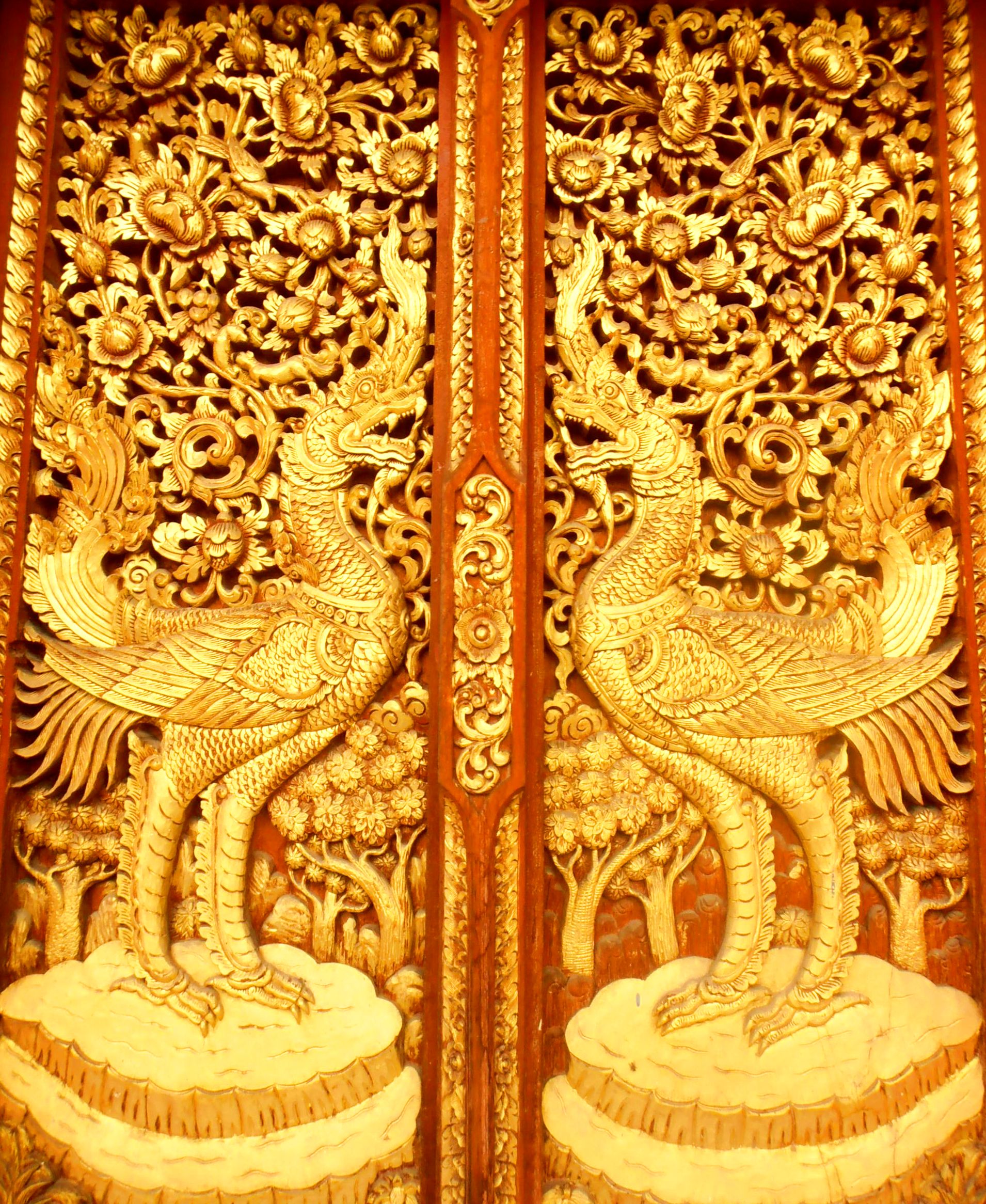
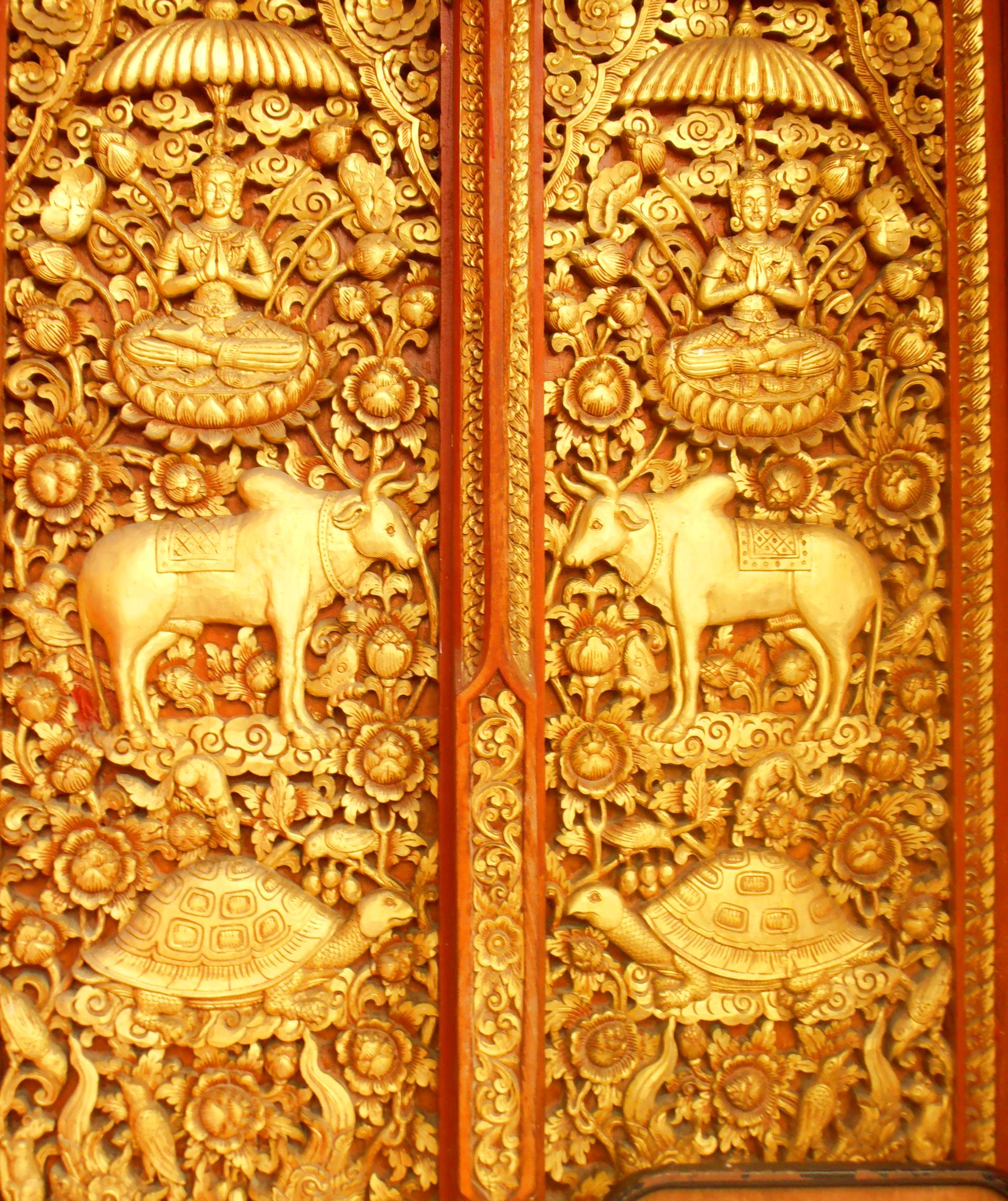
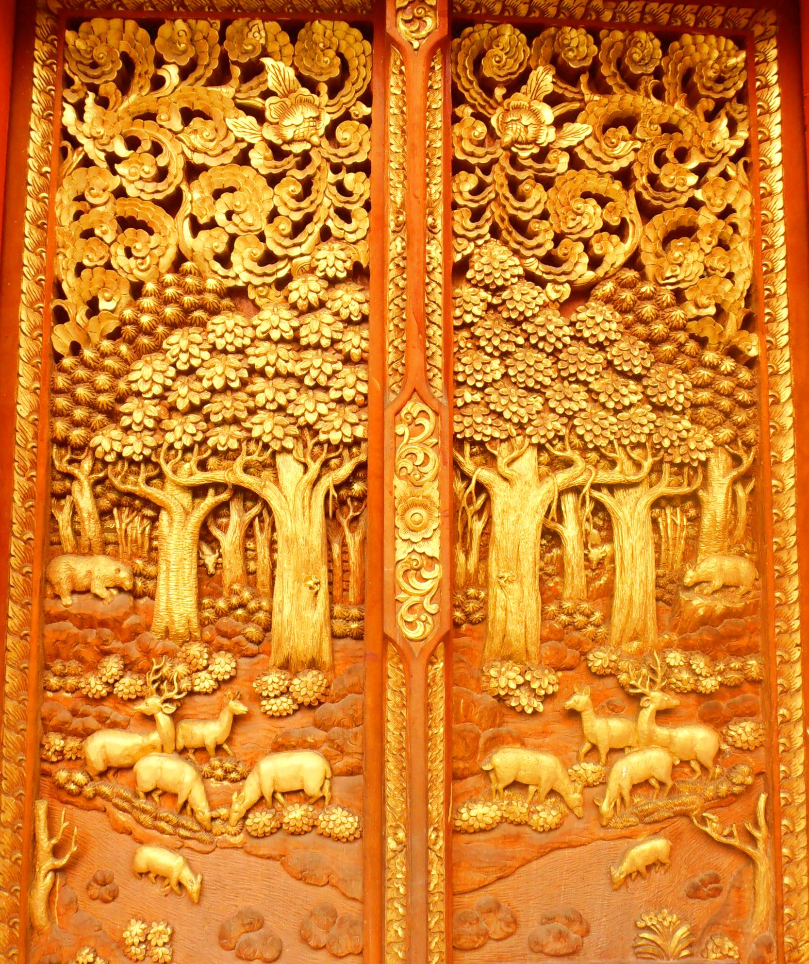
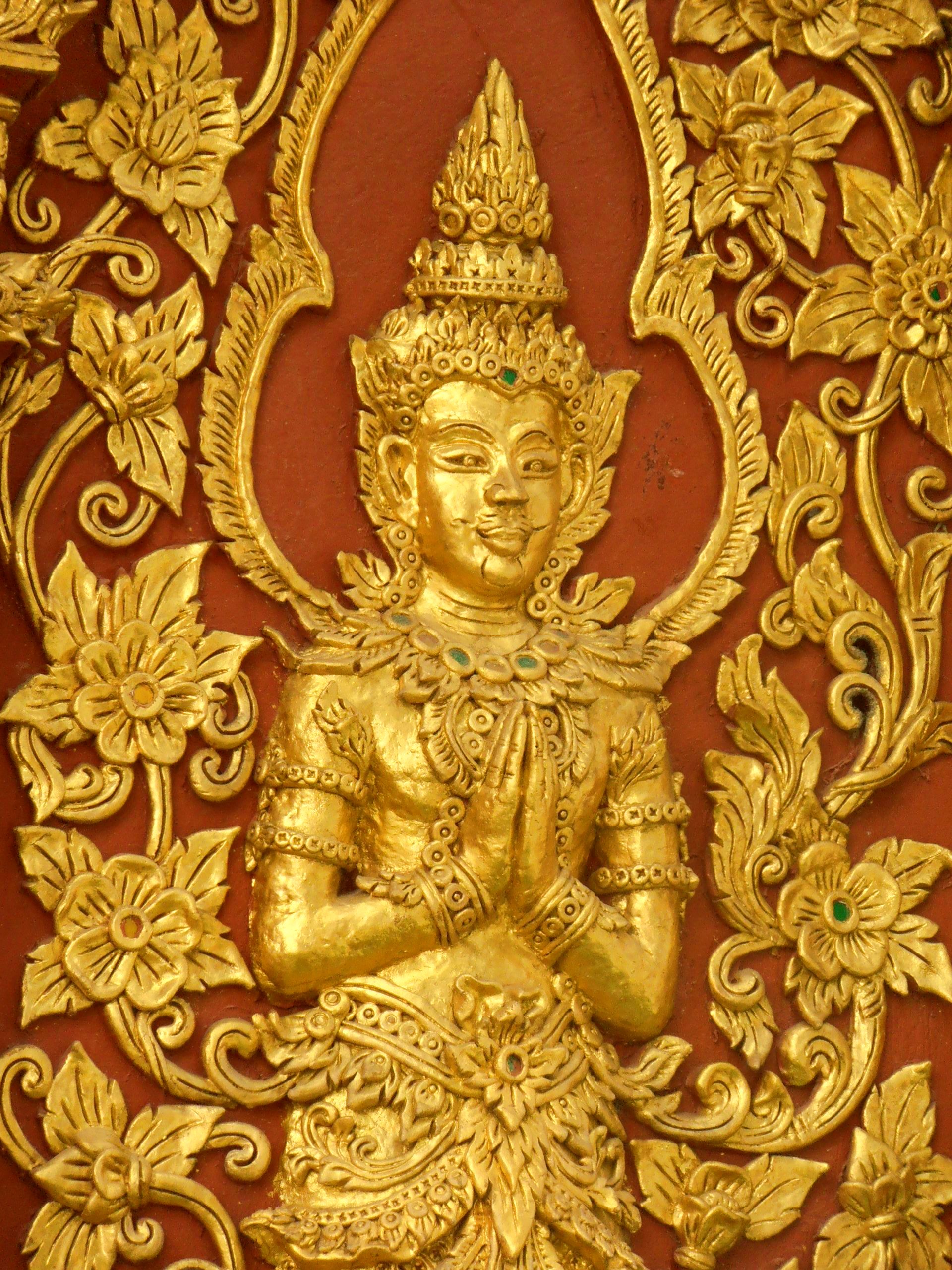
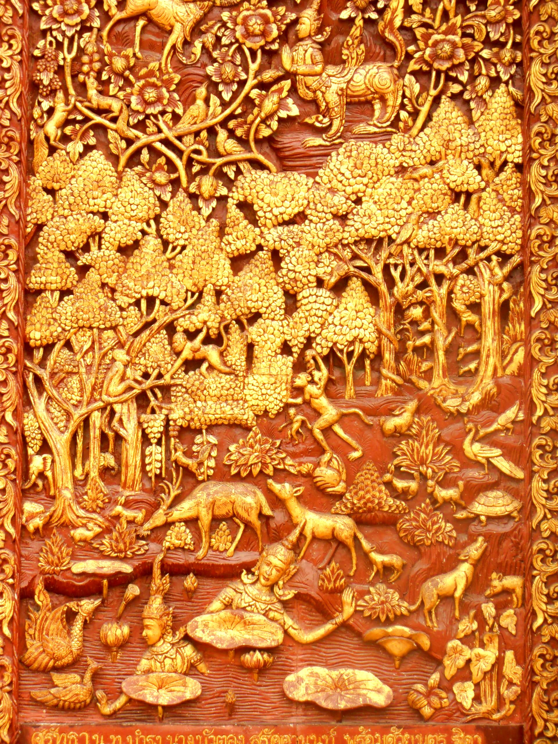
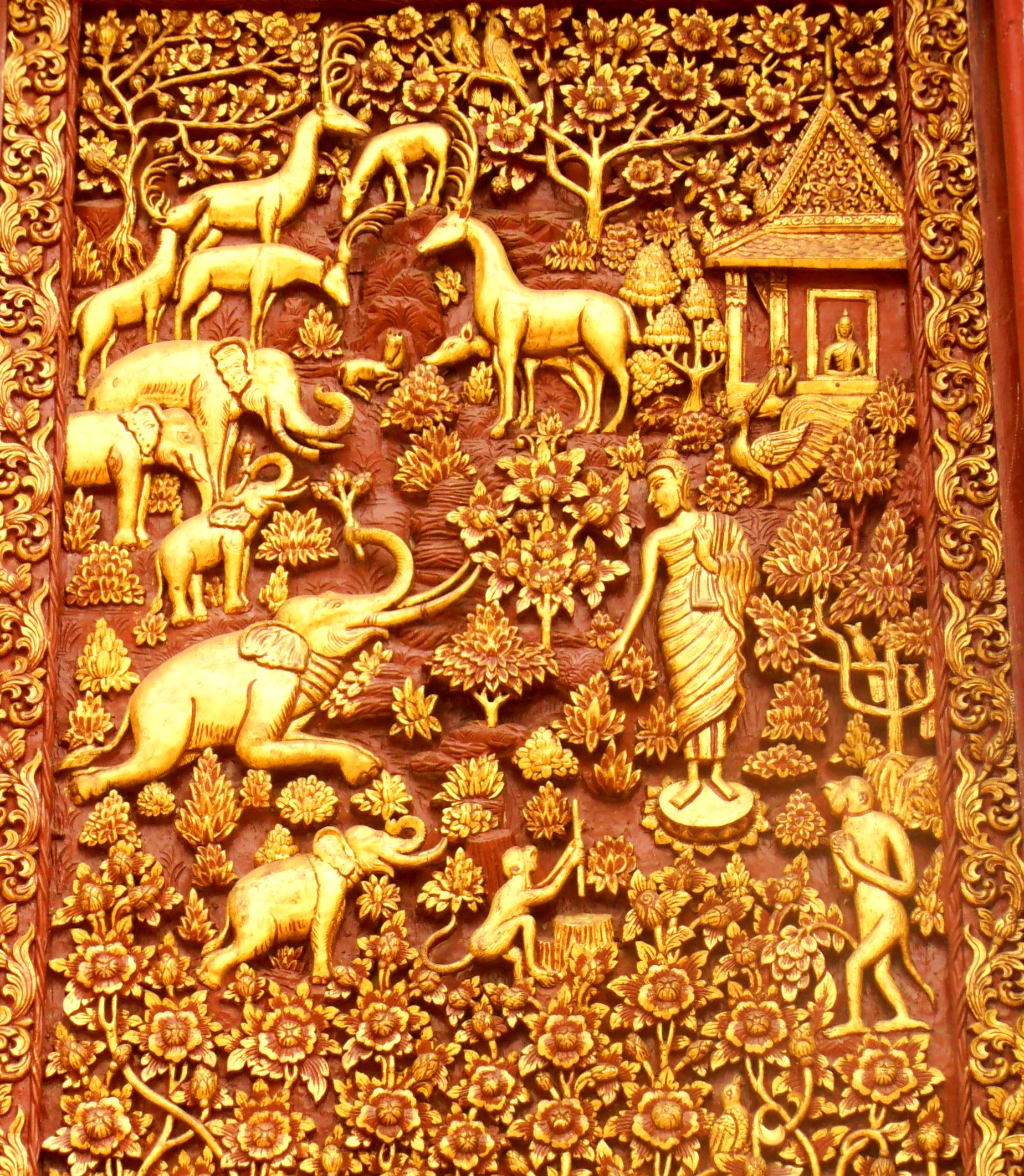
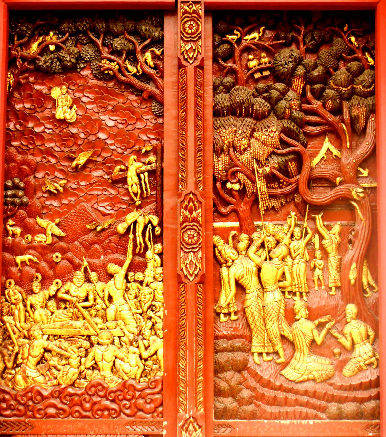
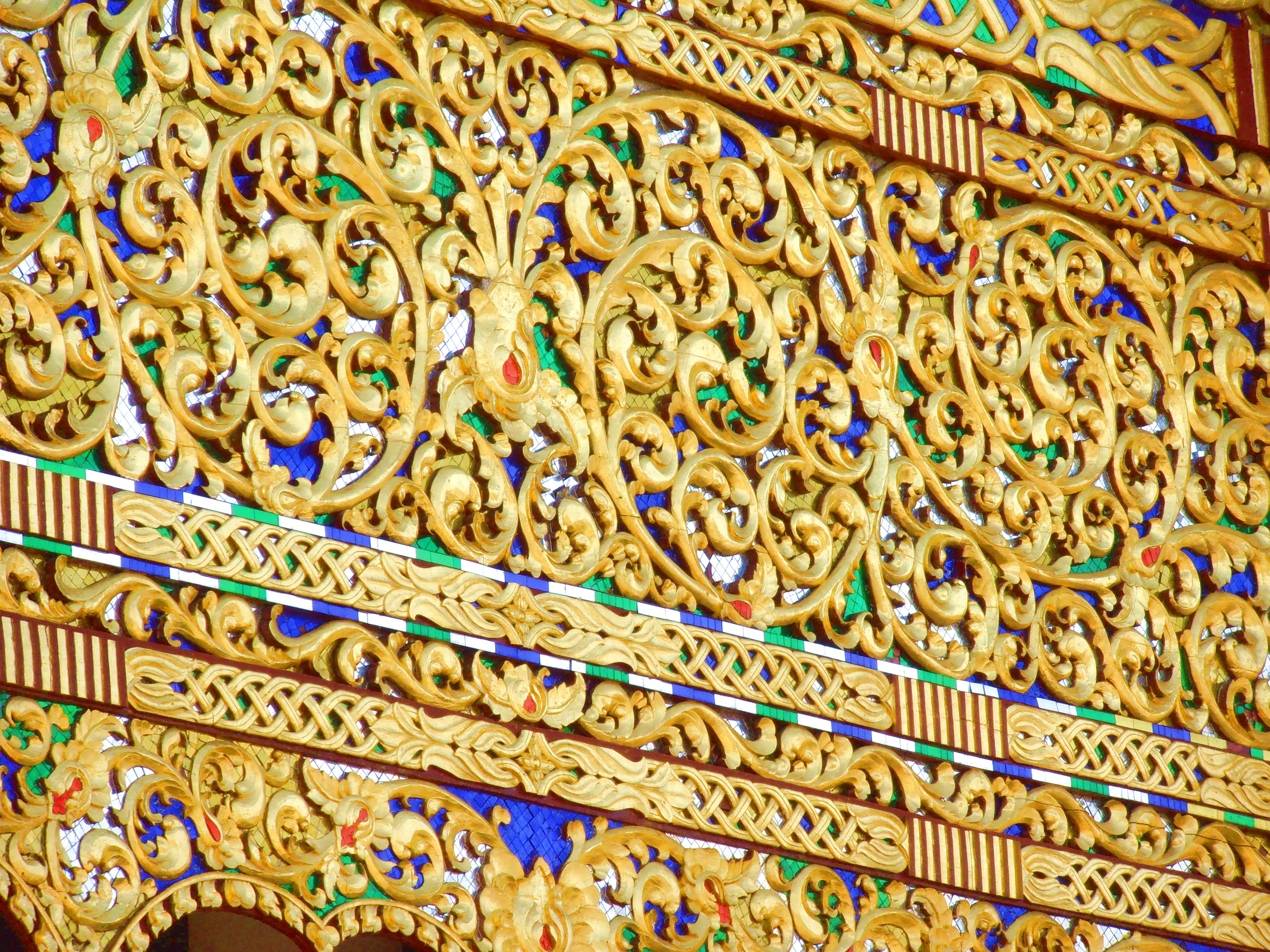
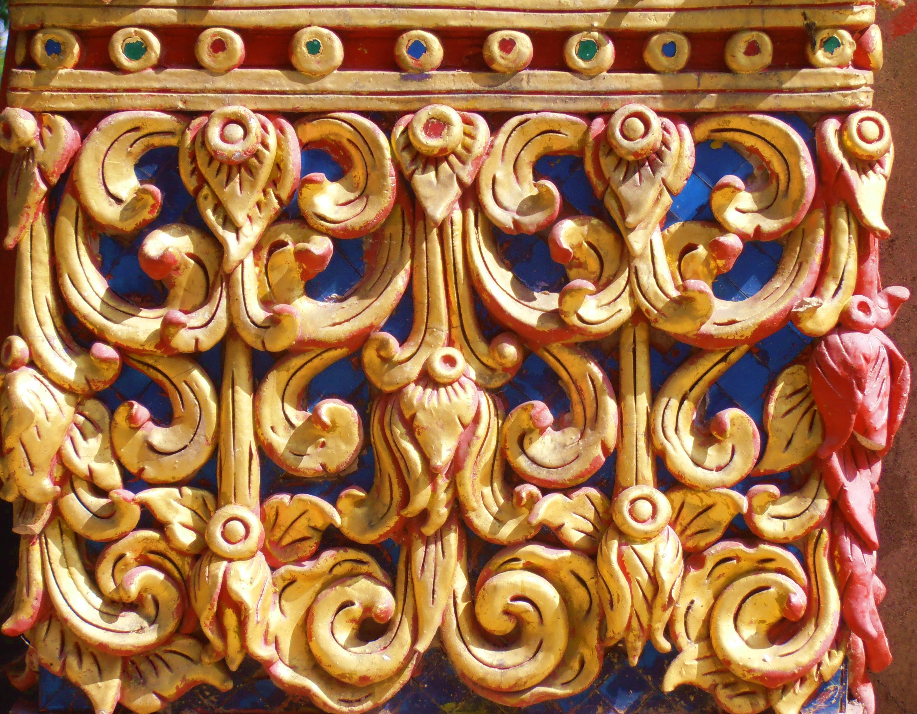
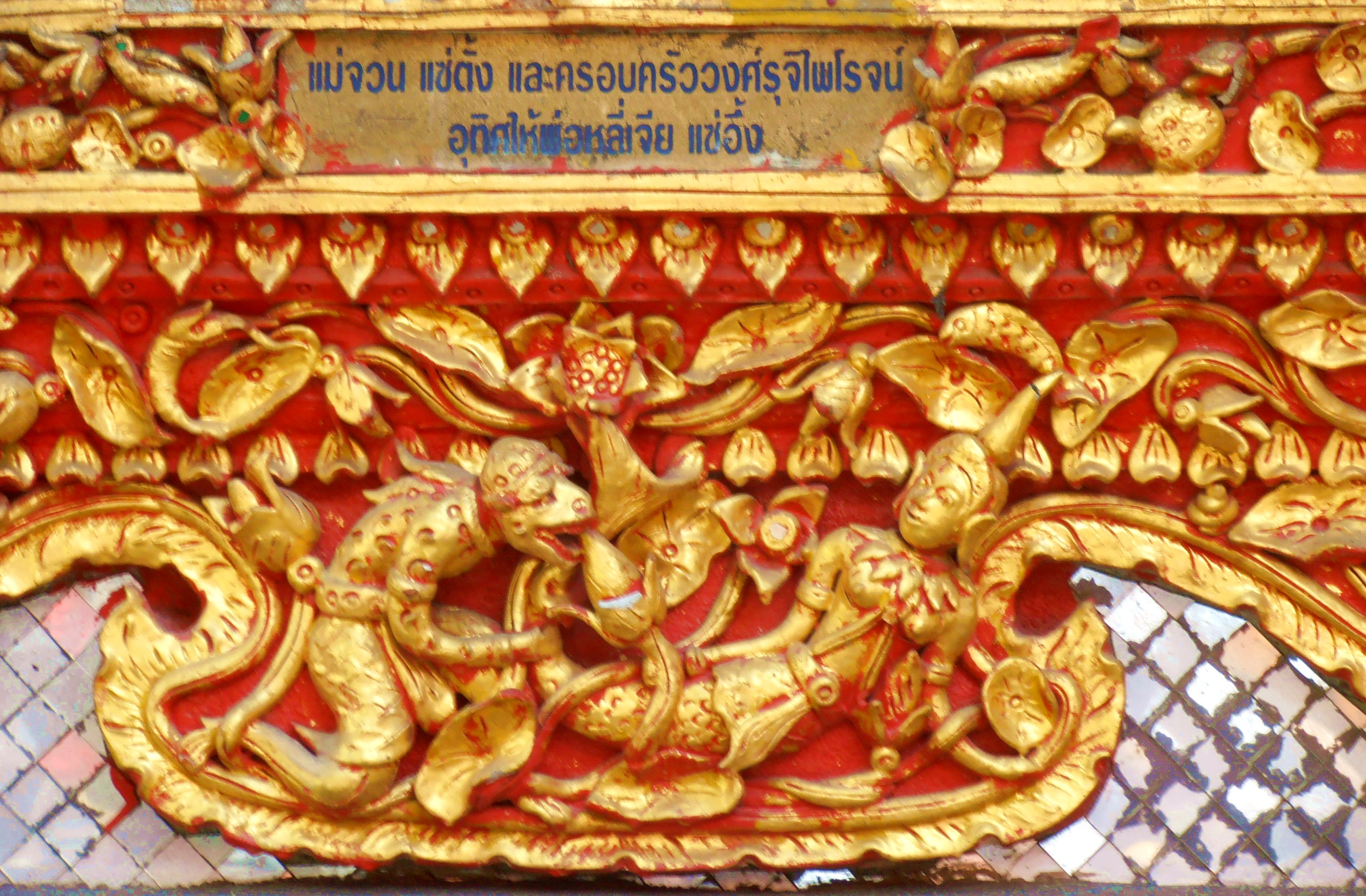
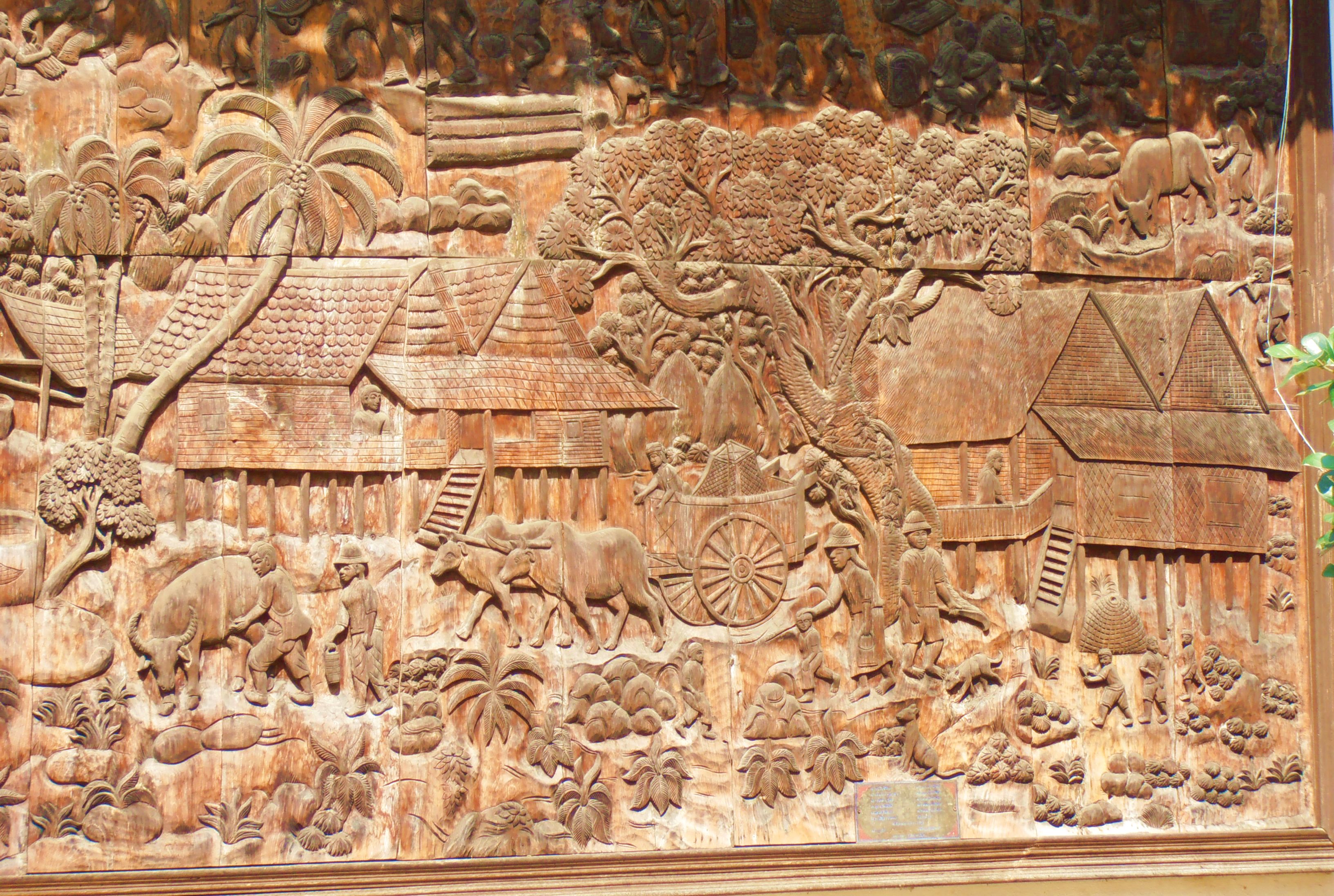
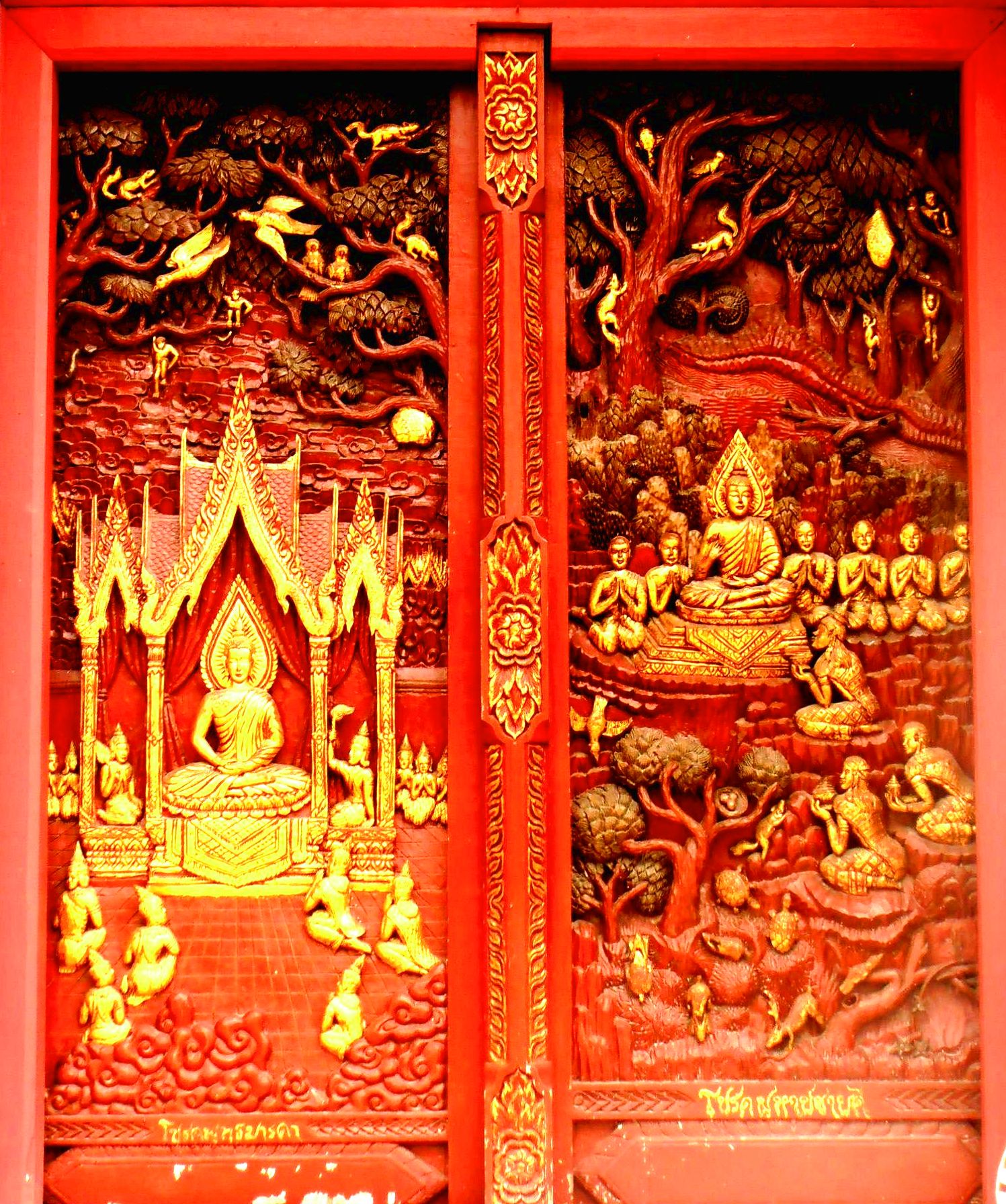
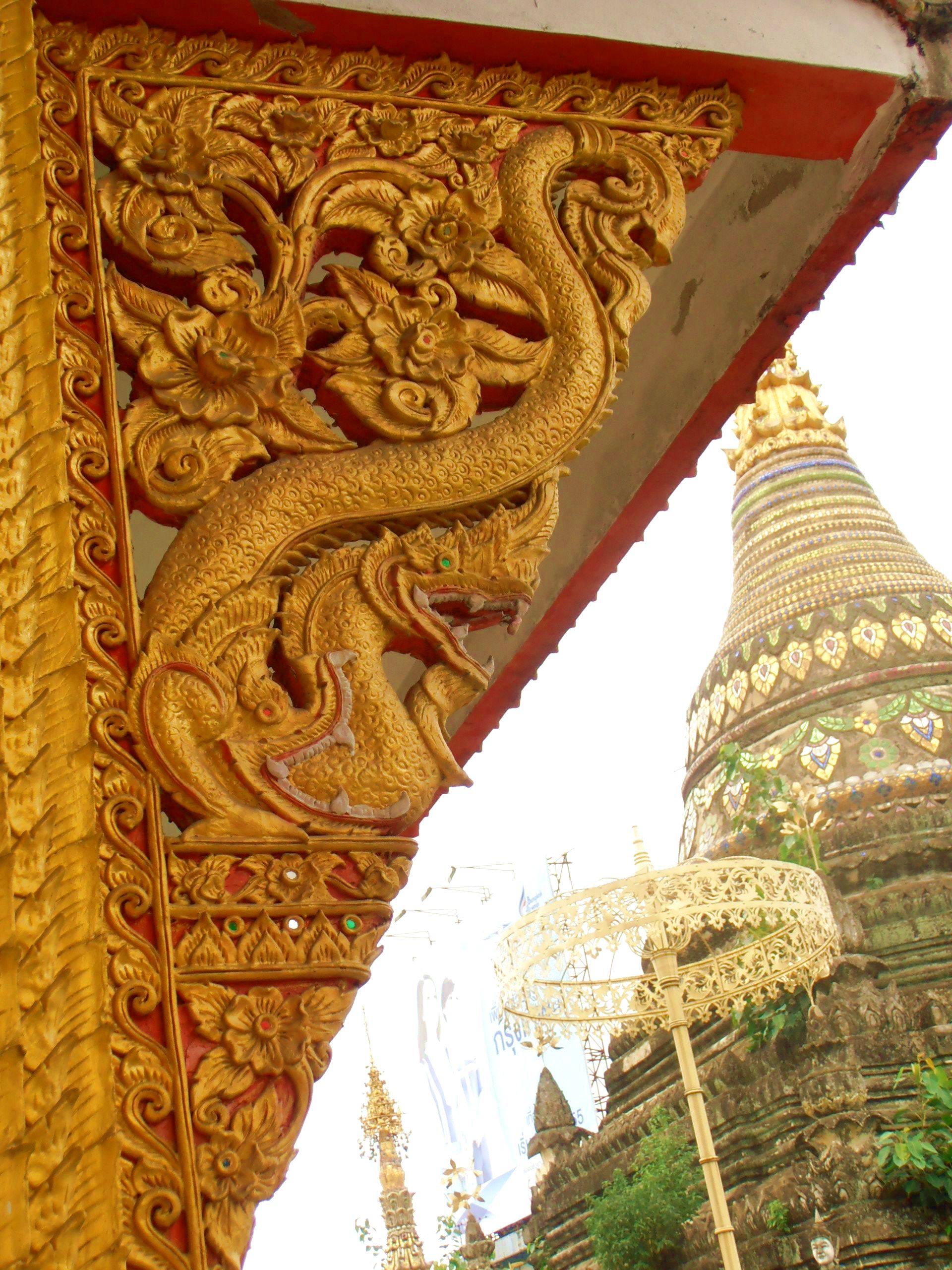
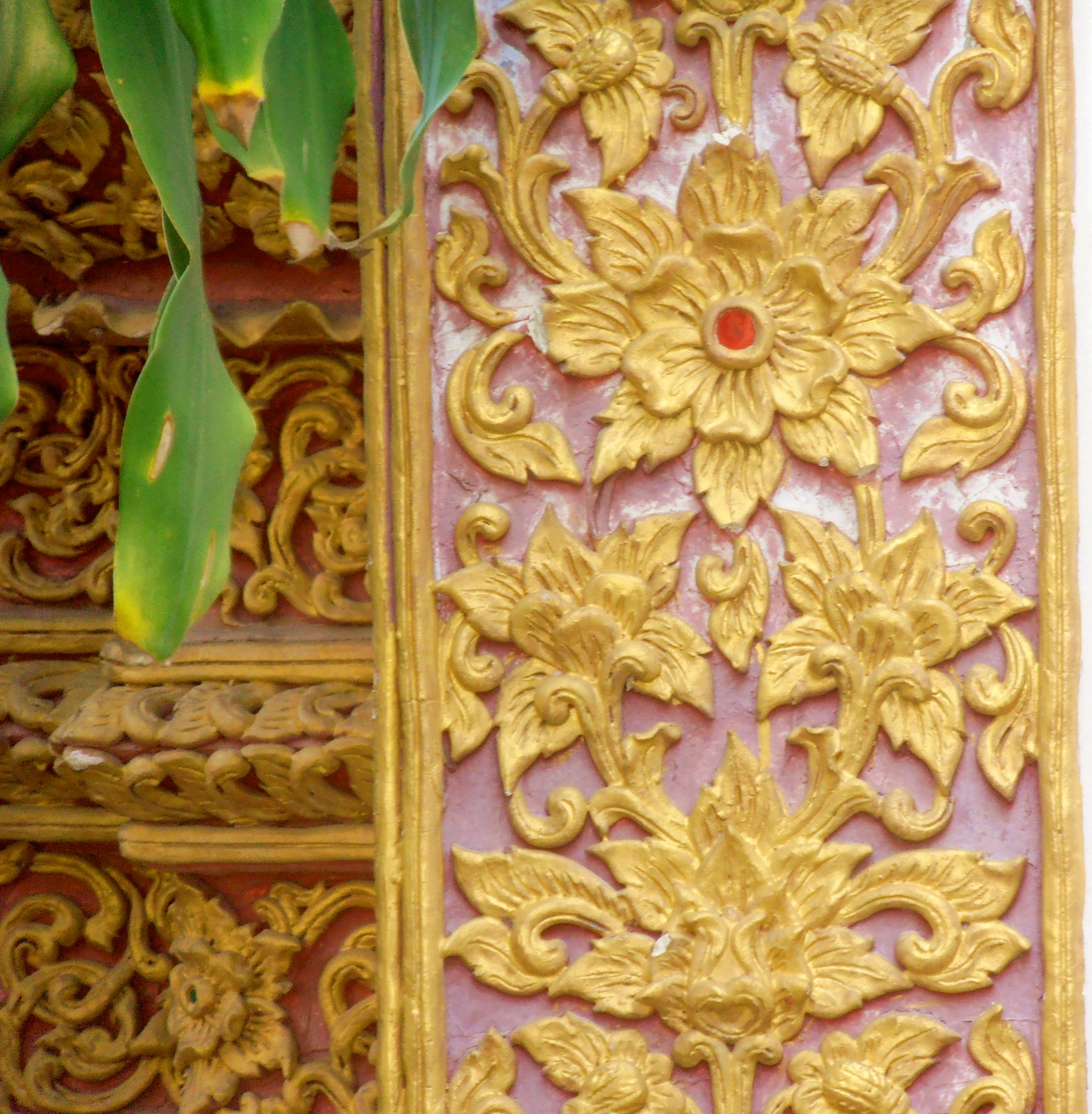
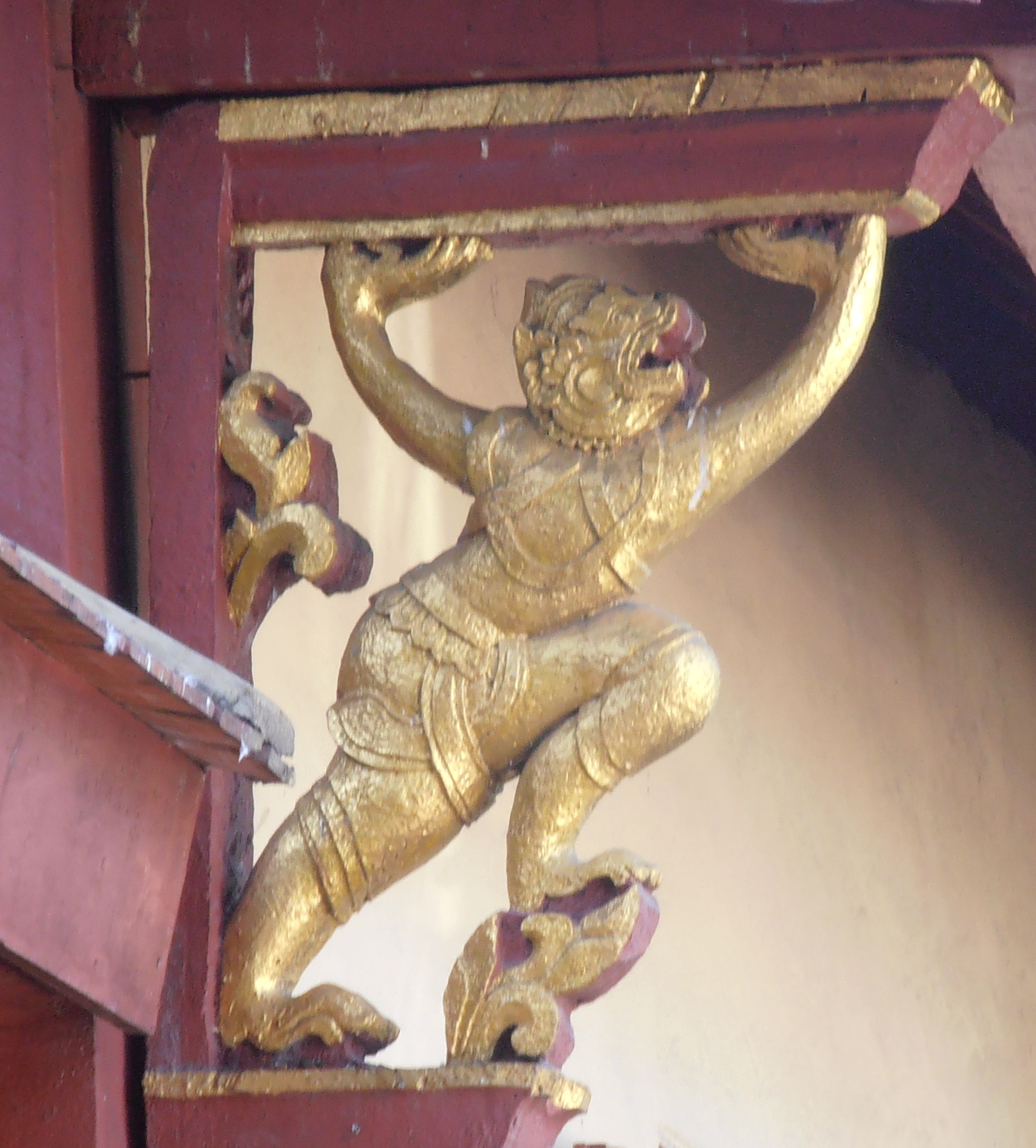
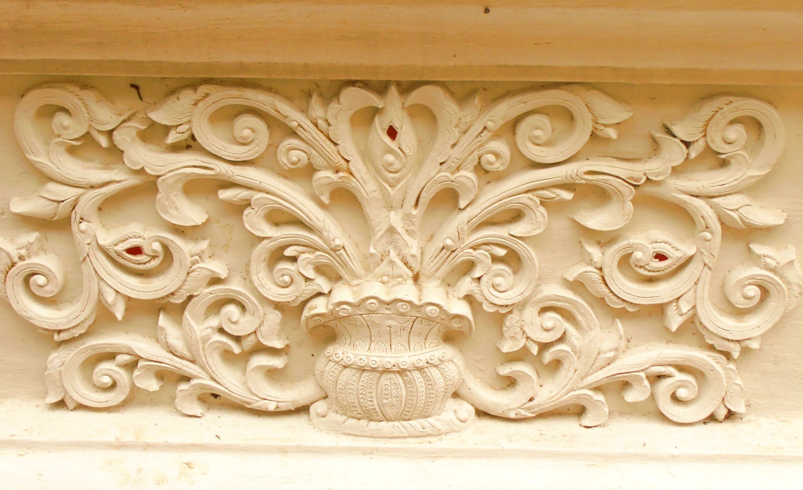
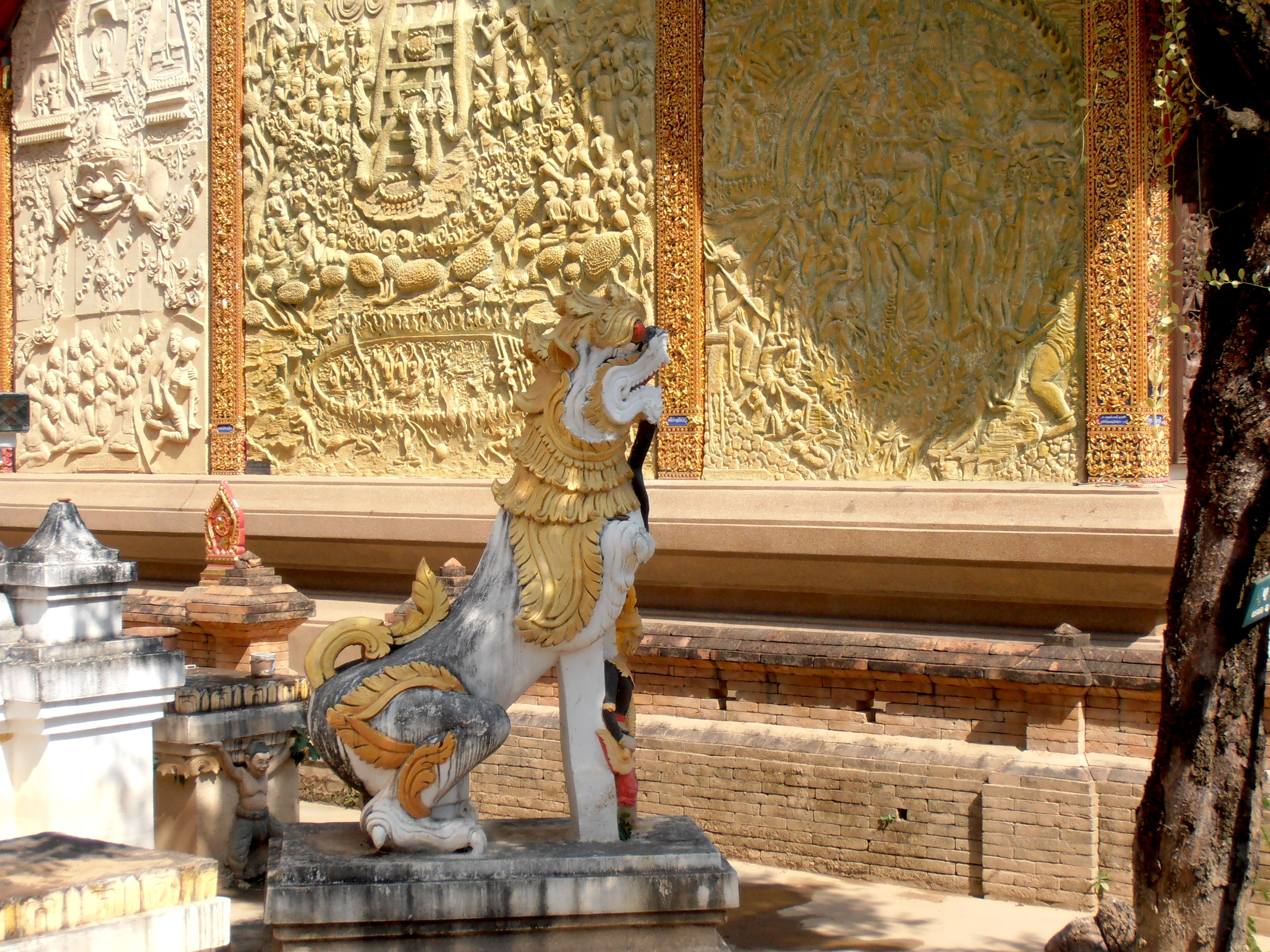
The Thais are master woodcarvers and work miracles with stucco. The intricacy of some of the carved work I’ve seen at Old City temples makes the European Baroque look positively restrained in comparison. Here are some images of treasures I’ve come across in my wanderings:
Right at the outset I must apologize for my spotty knowledge of Buddhist iconography. If I were up to the job I’d be delighted to explain the meaning of the images rather than just point in admiration of their artistic merit. As far as the Buddha’s life goes I manage fairly well, but when it comes to the mythical creatures of the Thai tradition and the subtle interplay of meanings within complex compositions like those you see in the pics above, I’m way out of my depth. Consequently, I’ll let the hand of discretion fall over my big mouth and just comment on what I know about or what seems important to draw to attention.
When you go around the temples looking at things the eye gluts very quickly, overwhelmed by the sheer quantity of visual input available. For that reason I think multiple visits to a temple are de rigeur, otherwise you fail to take in both the macro and micro levels of the art and craftsmanship on display. Since the Old City temples have no extensive grounds at their disposal — unlike many of the wats outside the Old City, which form complexes containing several buildings and display an aesthetic that varies between the component structures — the density of ornament seems to me particularly high. It’s as if the artists felt the need to pack the maximum amount of ornament and meaning into the limited space available. Consequently, it’s more common to find in the Old City wats works like the panels shown in the first two rows of images, where a story or a history is given in a series of individual works related to each other in a particular part of the building.
Linear perspective as we know it in European art from the Renaissance forward is not a part of the traditional Thai repertoire. That difference shows both in painting and in sculpture, as you can see in the first image of Row 3, which is an unusually complex composition using figures, a rarity in Thai temple art in my observation. The relative size of the figures often depicts relative importance to the matter being represented, so the Buddha, for example, will loom large even if placed in the composition in a position that by dint of perspective should have smaller dimensions. But at the end of the day we’re not dealing with Piero della Francesca, so it’s all good. It makes perfect sense in the framework of its own aesthetic and that’s all that really matters. If Thais put their minds to it, they can achieve the same level of dynamism and energy in group compositions that the Italian Renaissance masters pulled off, even without the trick of linear perspective.
The last image in Column 1 is a beautiful example of bas-relief in stone, which one finds occasionally but not in great quantity. The subject of the composition is what I found particularly appealing. It’s a glimpse into the daily life of the people of whatever period the piece comes from, which emphasized for me the integration of temple life into the daily life of Thais. That integration was a major point in the post I wrote about Wat Palad (here). It’s lovely when you come across it in a temple setting. It erases any sense of being on your tippy toes lest some nun come out from behind a curtain and give you grief for doing something untoward in a House of the Lord. It’s all good, the sacred is everywhere for Thai temple art, so you can relax.
Painting
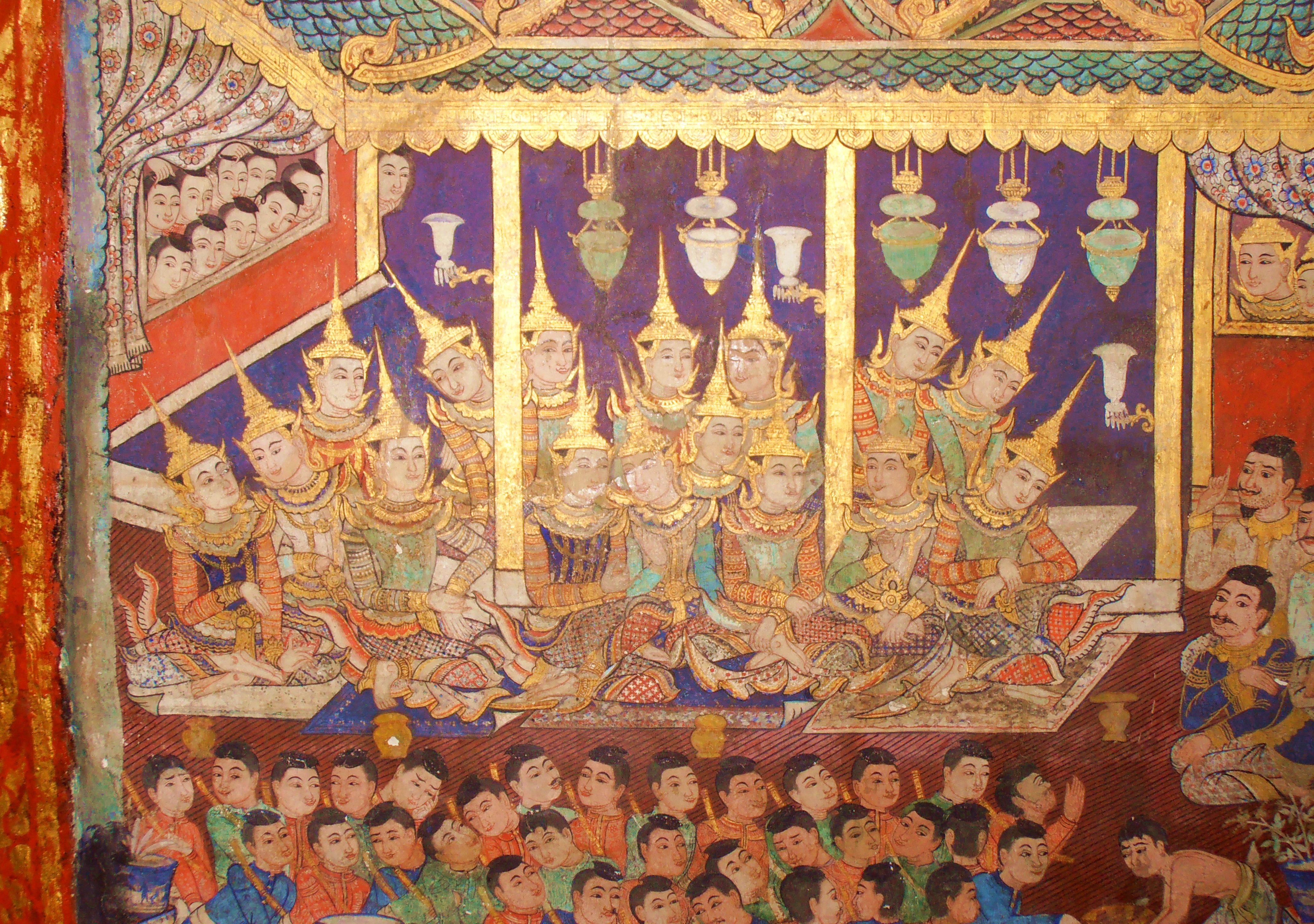
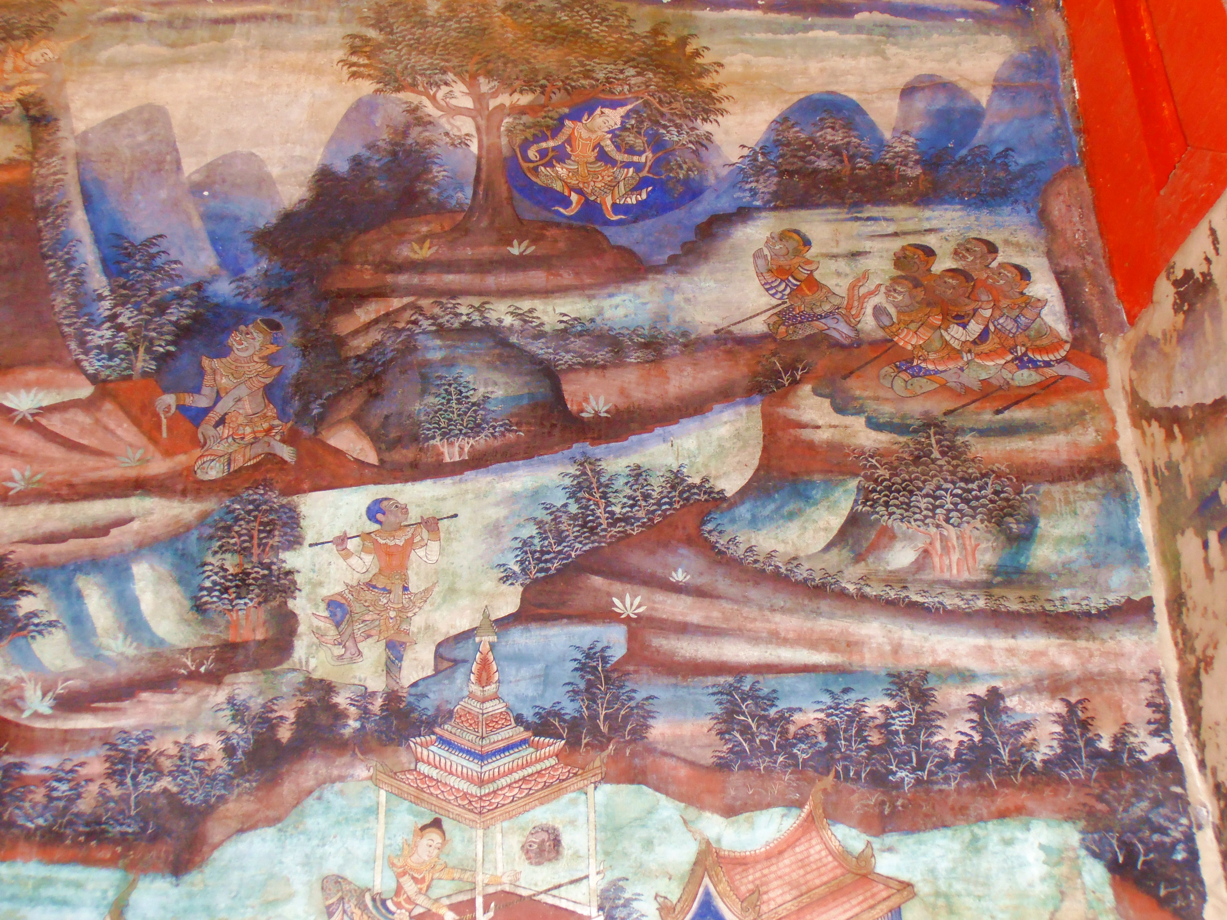
Painting doesn’t figure as largely in Thai temple art as it does in Western religious art. There are a few major works resembling fresco cycles, but very few, and they aren’t frescos, they’re works painted on wooden panels usually on a small scale in an ubosot, not blazened across huge walls in a vihara. I’ve never seen any major works of painting in a vihara. The visual organization of figures in Thai painting does require an adjustment on the part of a Westerner, I think — as mentioned, we’re used to linear perspective in large compositions and tend to think of compositions in two dimensions as primitive or somehow less accomplished than compositions in three dimensions. Well, the glory is in the detail, as is so often the case with Thai art. So have a look:
I will admit that my reaction to such paintings is probably not what a Thai would feel, nor are some of my responses entirely appropriate, so when I’m viewing them on site I keep my mouth shut. The second pic in Column 1, for example, I find very jolly. I’m sure the people represented are worthies of some sort commanding the highest respect in the iconographic scheme of things, but they look to me for all the world like a human porcupine with their pointy hats bristling in a roundel of spikes that would impale a finger in no time flat. They also look like they’re having a very good time. Such reactions on my part are all well and good as long as I keep quiet, nobody’s the wiser and I have my spot of fun without doing any harm.
The second image in Column 2 does leave me a bit perplexed, I will own it. There are so many planes of view in the picture it seems about to explode off the wall from some detonation happening in the earth beneath the images on the surface. In such cases one really must put Piero della Francesca and Co. out of mind and take things on the evidence before one’s eyes. The color palette of the painting is exquisite, the forms are beautifully drafted, so what does it matter if the composition remains inscrutable? I have no idea what’s going on in the picture, but that doesn’t diminish my enjoyment of it. It’s all good for the memoirs.
Architectural Detail
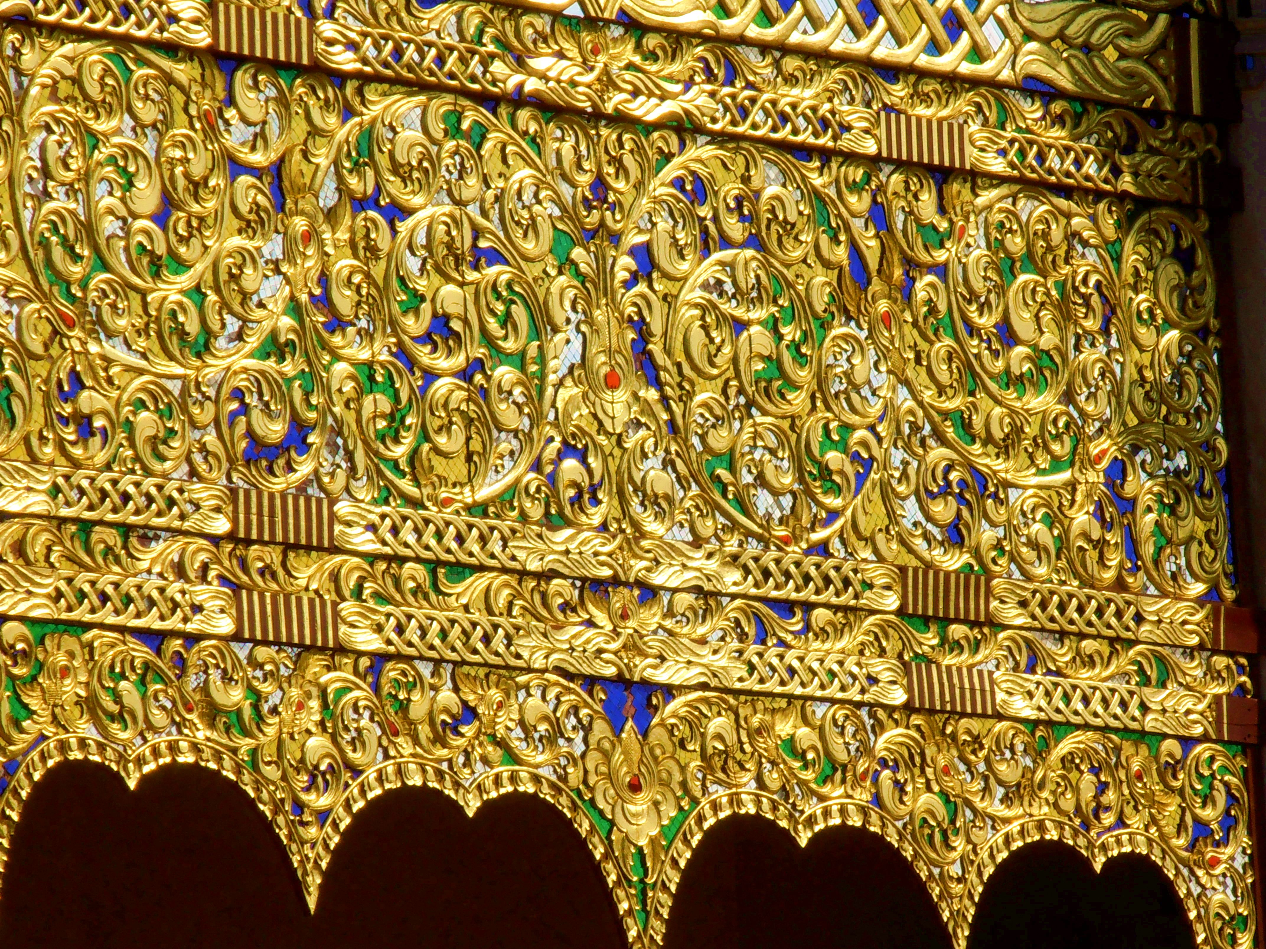
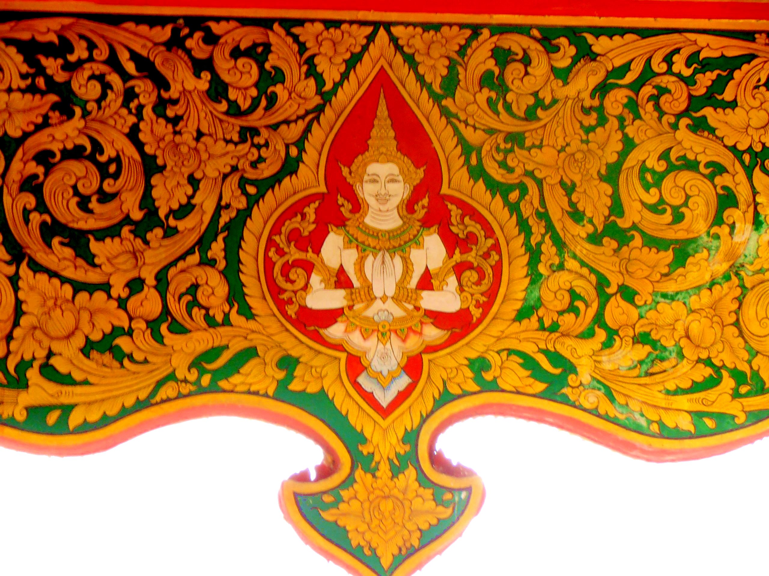
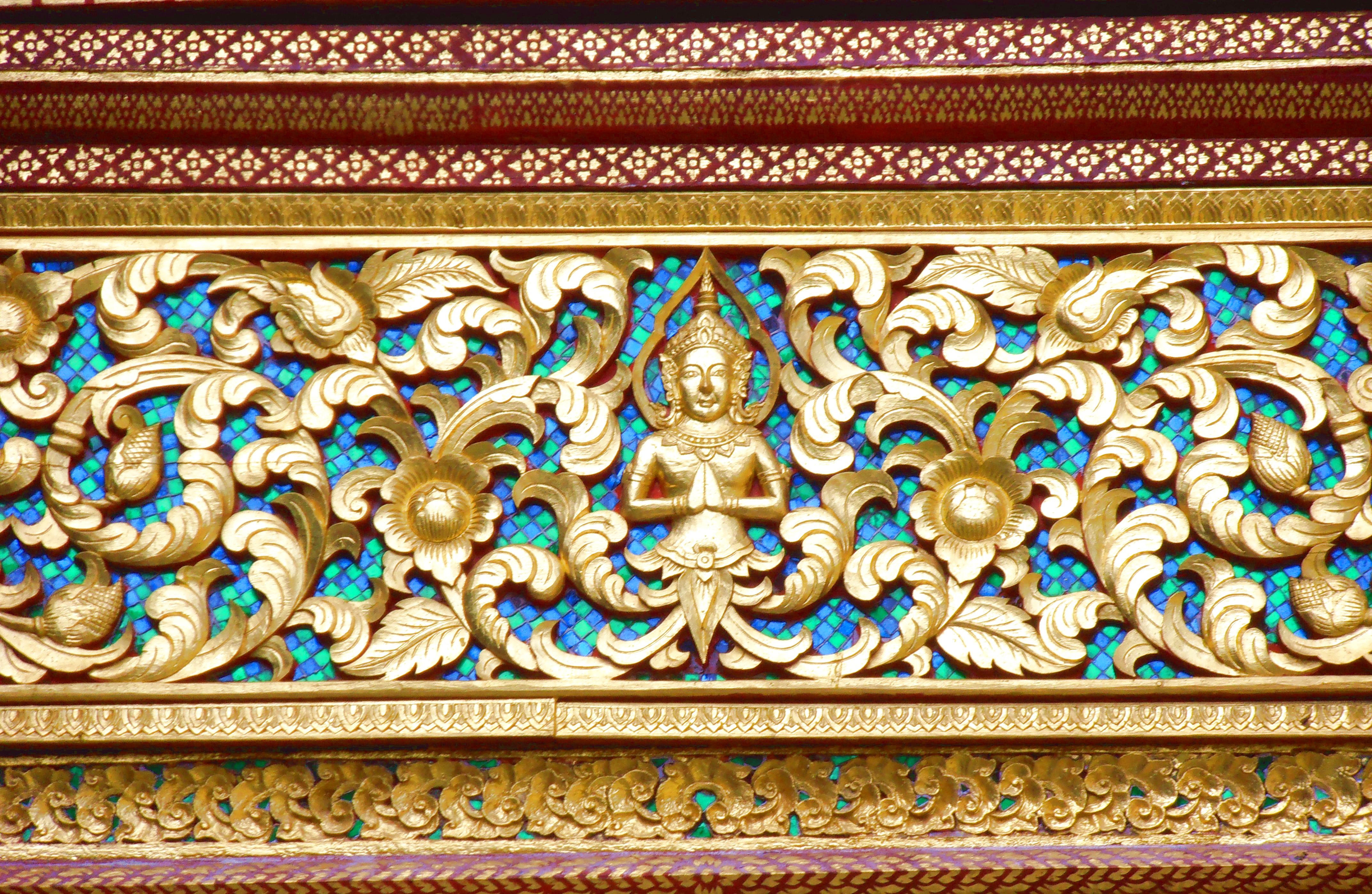
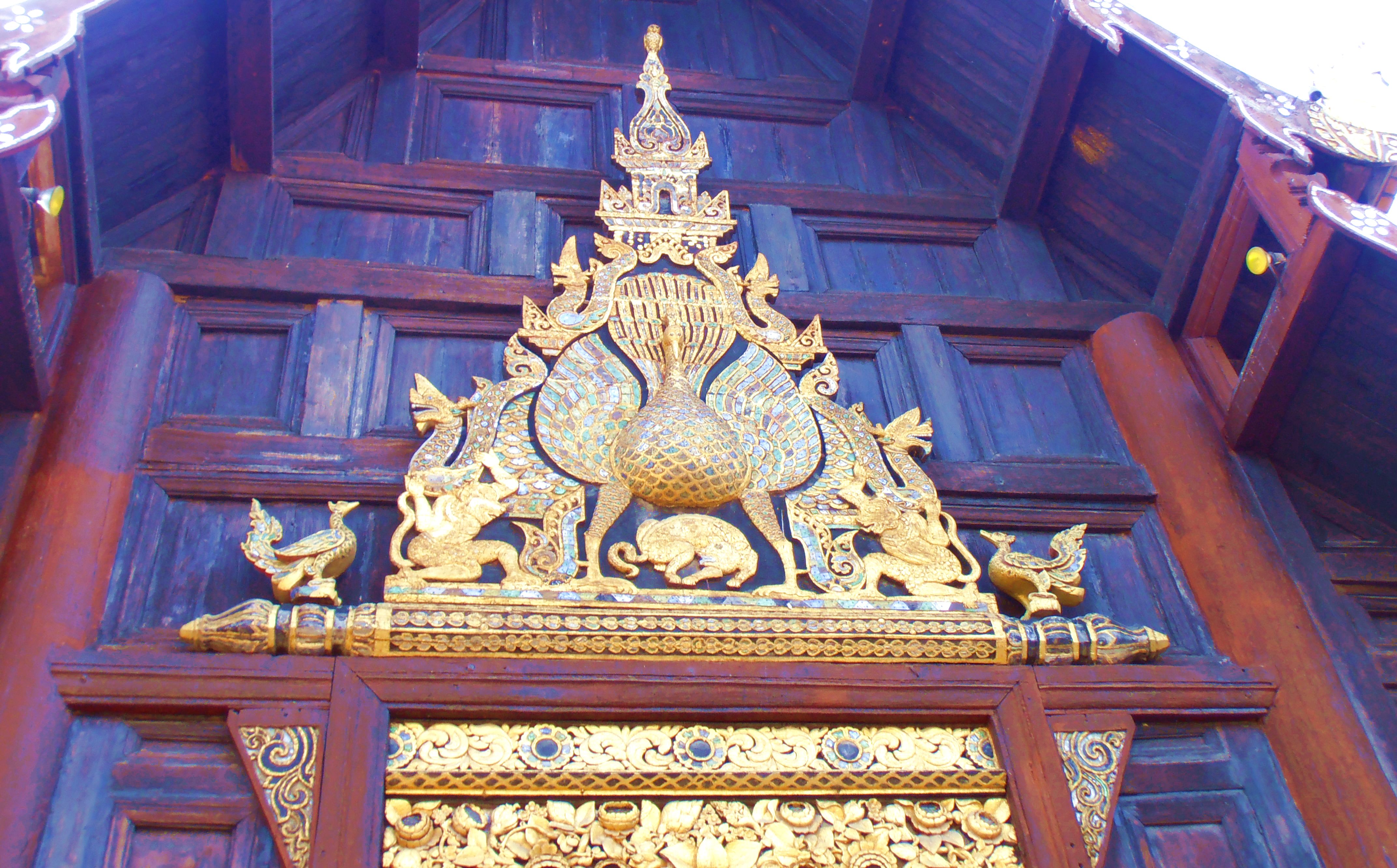
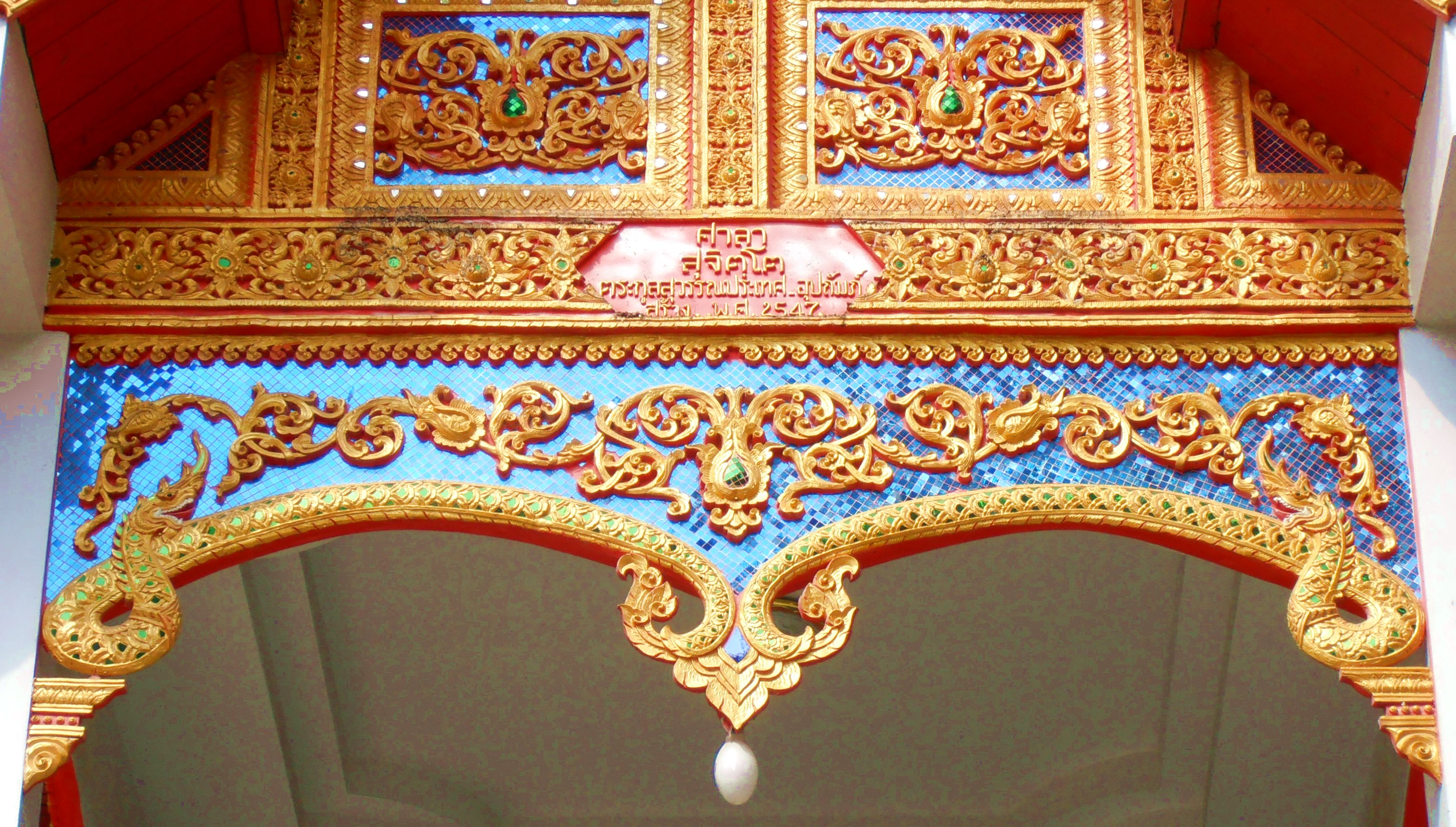
Here we come to a very important part of the aesthetic scheme of things in Thai temples. If there is a surface, it deserves ornament — that appears to be the principle in operation. Some of the most enchanting details I’ve seen come from lintels, ceiling panels and gables. The inventiveness of Thai craftsmen seems endless when faced with such oddments of architectural space. The care and attention lavished on things placed in such positions is equal to those given pride of place nearer eye-level. Here are some of the details that captured my attention:
These images reinforce what I said about the eye being glutted with a surfeit of loveliness in a Thai temple. There’s so much to see in every direction it seems impossible to take it all in. For that very reason after I visit a temple in Chiang Mai I know I’ve only scratched the surface, even if it’s the fifth visit. One could go back again and again and still discover something one hadn’t noticed earlier. Details as intricate as the first image in Row 1 deserve focused contemplation to capture all the composition and to appreciate fully the careful execution. The temples of the Old City are riotous in their ornamental exuberance. There are, to be sure, other temples outside the Old City where things are considerably less demanding on the attention and the absorptive faculties — Wat Umong, for example, is a haven of tranquillity in its ornamental scheme. But as Mae West said, “Too much of a good thing is wonderful!” That’s precisely what keeps me going back to the temples of the Old City to be overwhelmed with loveliness. I wallow in it quite unapologetically.
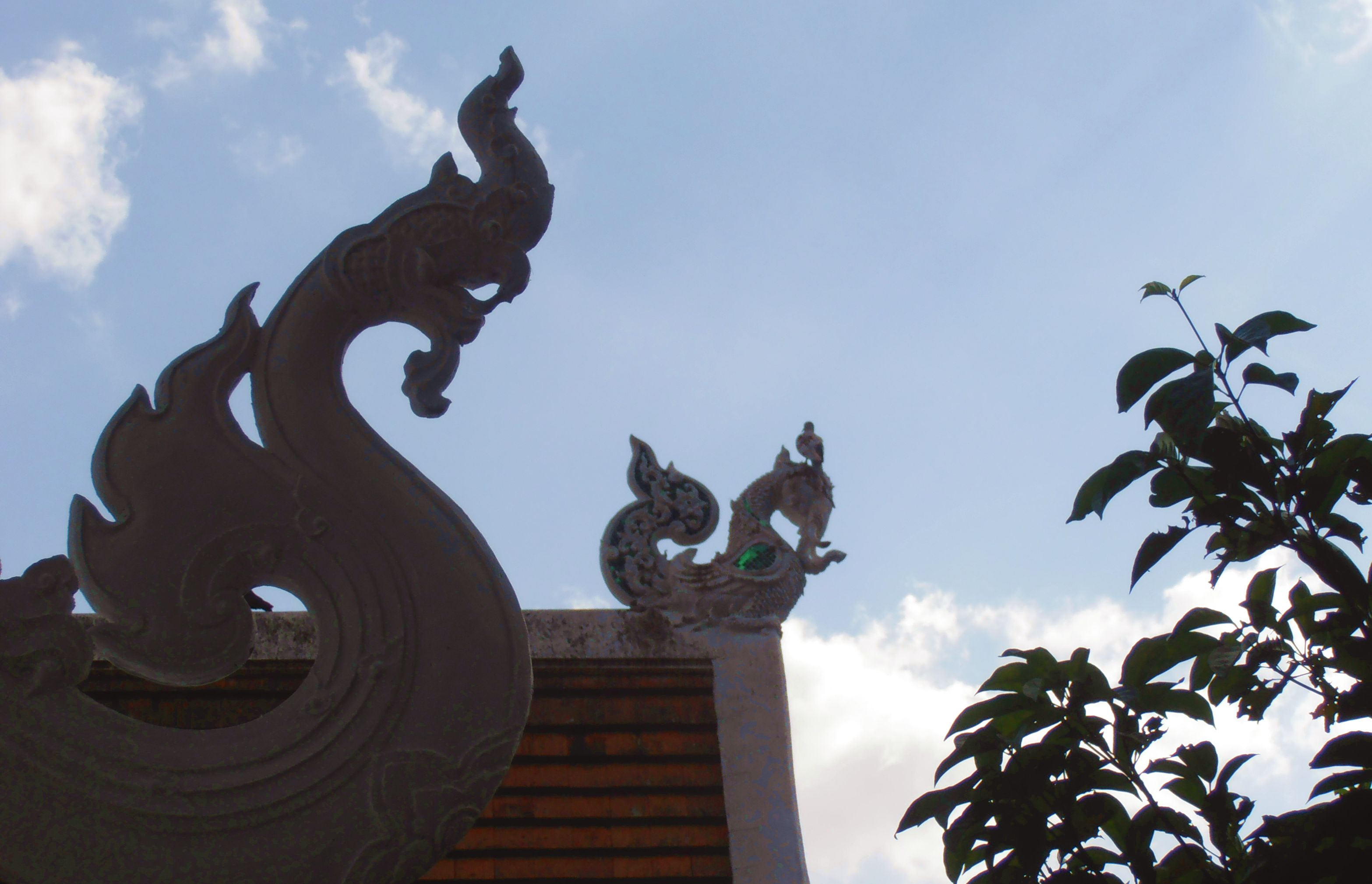
The second image of Column 2 shows the Thai penchant for striking form. This group of figures sits atop a gable at great enough distance to make detail on the figures imperceptible. The aesthetic coup is achieved with form itself through the silhouette the figures cast against the sky. This image shows especially well the Thai penchant for elegance in form, I think. With color and texture removed from the equation, we have here a reduction to the bare essentials — line, light and shadow. To my mind, no color or texture is needed to enhance the effect, it’s perfect without any additions. This innate ability to achieve elegance and balance in form underlies everything one sees in Thai art, in my opinion. It’s what imparts a sense of repose and poise even to the most riotous decorative compositions one sees. Coming across sights like this gable group reminds me of the essentials and how fundamental they are to the entire aesthetic program. It’s good to see the bones laid bare once in a while to have your attention brought back to first principles.
The first image of Column 2 is again one of those instances where the composition threatens to explode off the pictorial space. I spent a long time trying to puzzle out all the details of the composition and how the elements relate to one another. This is one architectural detail among many hundreds of a single temple, something most people would likely notice only in passing. It just goes to show that a Thai temple should be treated like a plant in the hands of a botanist — no detail is too small, no element too subsidiary. Everything counts, everything is worthy of careful observation. Only through such attention to detail can one hope to apprehend the totality of the beast. I’m reminded of the laboratory practice of the great naturalist Louis Agassiz (Wikipedia page here) when dealing with new students. One such student, Samuel H. Scudder, recounted how he was taught to see the many details of a fish specimen through the school of hard knocks Agassiz used with his proteges (full text here):
“Oh, look at your fish!” he said, and left me again to my own devices. In a little more than an hour he returned, and heard my new catalogue.
“That is good, that is good!” he repeated; “but that is not all; go on”; and so for three long days he placed that fish before my eyes, forbidding me to look at anything else, or to use any artificial aid. “Look, look, look,” was his repeated injunction.
I have a similar feeling when looking at something like the work in the second image of Row 1. So much is going on and one’s attention is challenged on multiple levels to see both the detail and the coordination of all the elements in the total composition. Agassiz’ “look, look, look!” seems the only reasonable directive in the face of such intricacy. Fortunately, there’s no chance of the object of your contemplation going off due to the hot weather, so you can ogle as long as you like while remaining perfectly at your ease.
The second image in Column 2 (with Buddha in the center) shows the use of multiple media that occurs so frequently in temple ornamentation. Behind the carved figure with its leafy surround are tiny glass tiles that provide a color element to set off all the forms in the carving. Such pieces are usually seen from a distance, not up close, so the glass tiles provide only color rather than texture, as well. This is a happy invention, I find, because the color enhances the sculptural forms and lends a lightness, one might even say a cheeriness to the ensemble. I must confess, as well, that finding the Buddhas depicted throughout a temple to be uniformly jolly fellows brings another layer of delight to the viewing. Think of what you find in an Italian cathedral, for instance. Lurking somewhere in its vast recesses will be some alarming image depicting somebody being done to death, either Christ crucified or some saint meeting a bad end in some distressing manner — the image that comes to mind is a wonderful sculpture by Giacomo Serpotta in the Oratorio di San Lorenzo in Palermo of St. Lawrence being roasted alive on his barbecue grill. The last thing you’ll find in a Thai temple is a depiction of Buddha being thrown on the barbie. There’s none of that dreadful business lurking about in a Thai temple, thank you very much. You just get Buddha smiles that seem to suggest, “Don’t worry, be happy.” What’s not to like about that?
Sculpture and Stucco Work
When you’re standing in front of Michelangelo’s David in Florence, no questions arise in your mind about just what constitutes sculpture, it’s stood there right in front you: sculptor + marble = sculpture, a very simple equation. In Thai temples, however, there’s no marble sculpture reducible to such self-evident elements. I’ll admit that at times I have no idea what I’m looking at, whether it be stone or sculptured stucco, or perhaps even treated metal. So I offer no in-depth analysis of the pieces shown here, that would be a recipe for fallacy without a shadow of doubt. I simply purvey the images and leave you sort things out for yourself if the spirit moves you.
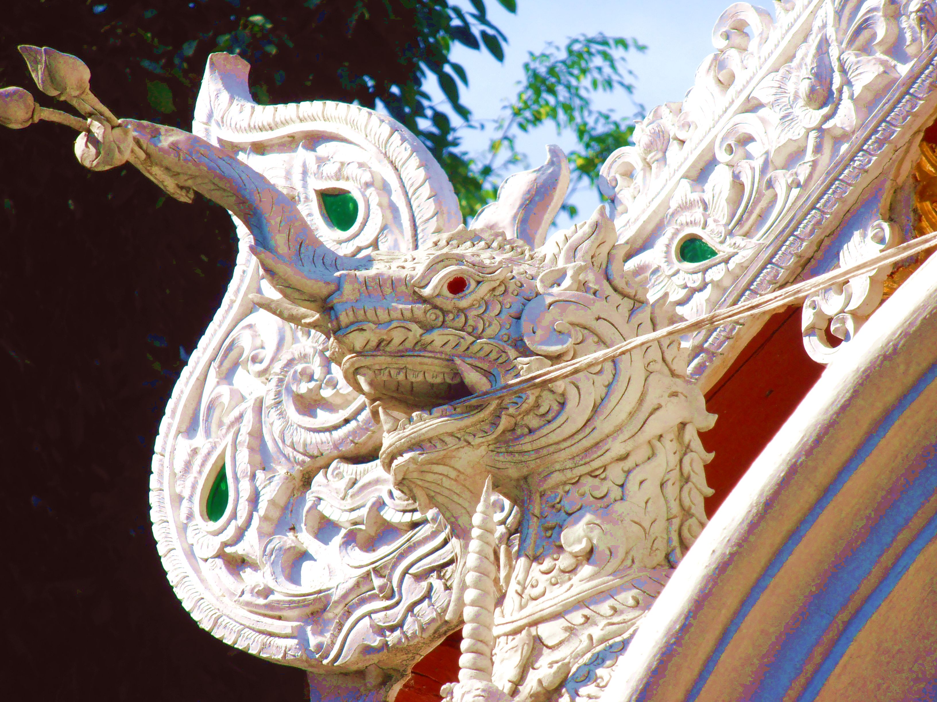
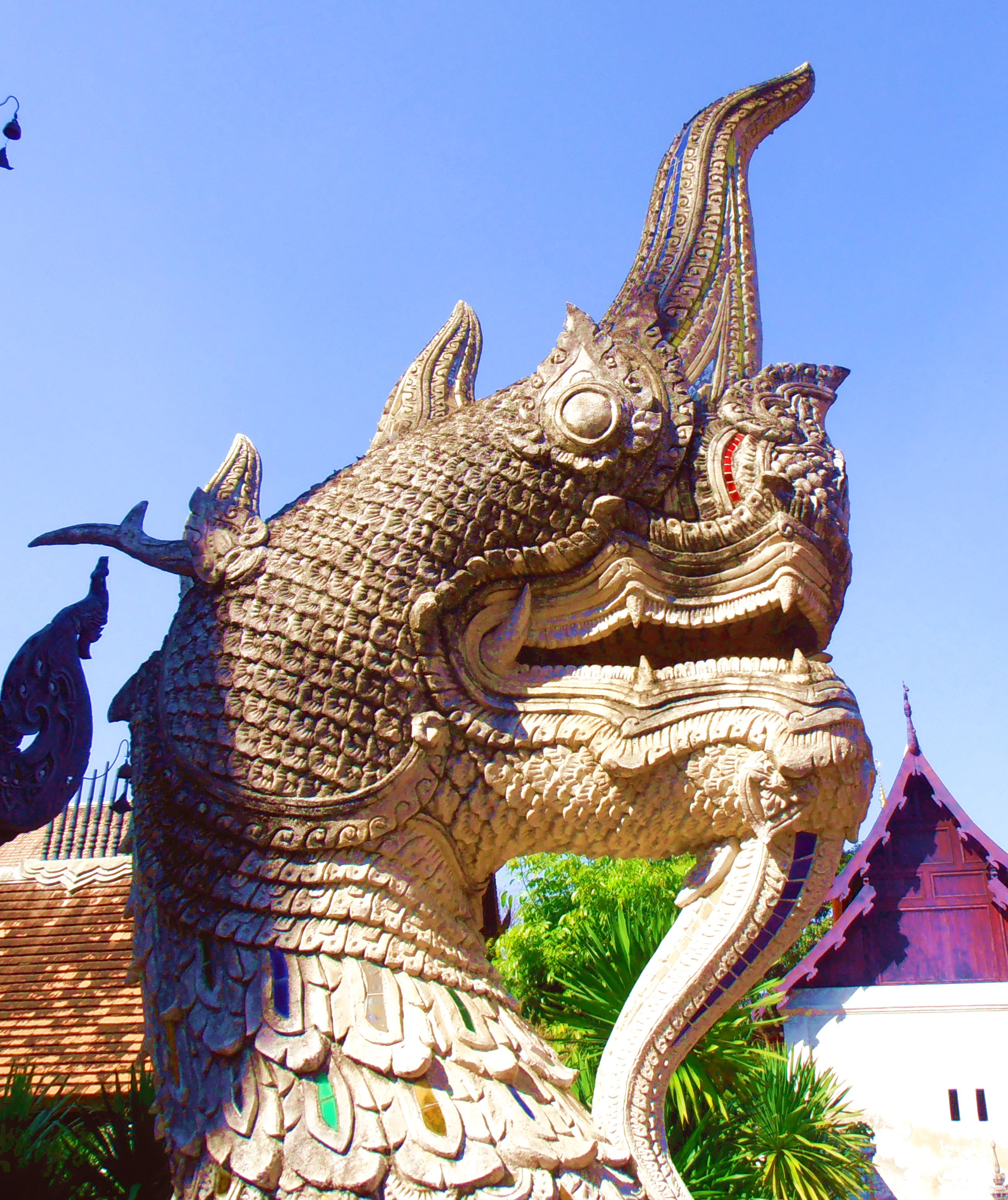
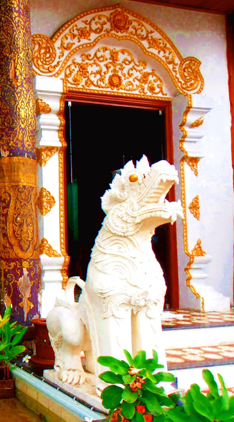
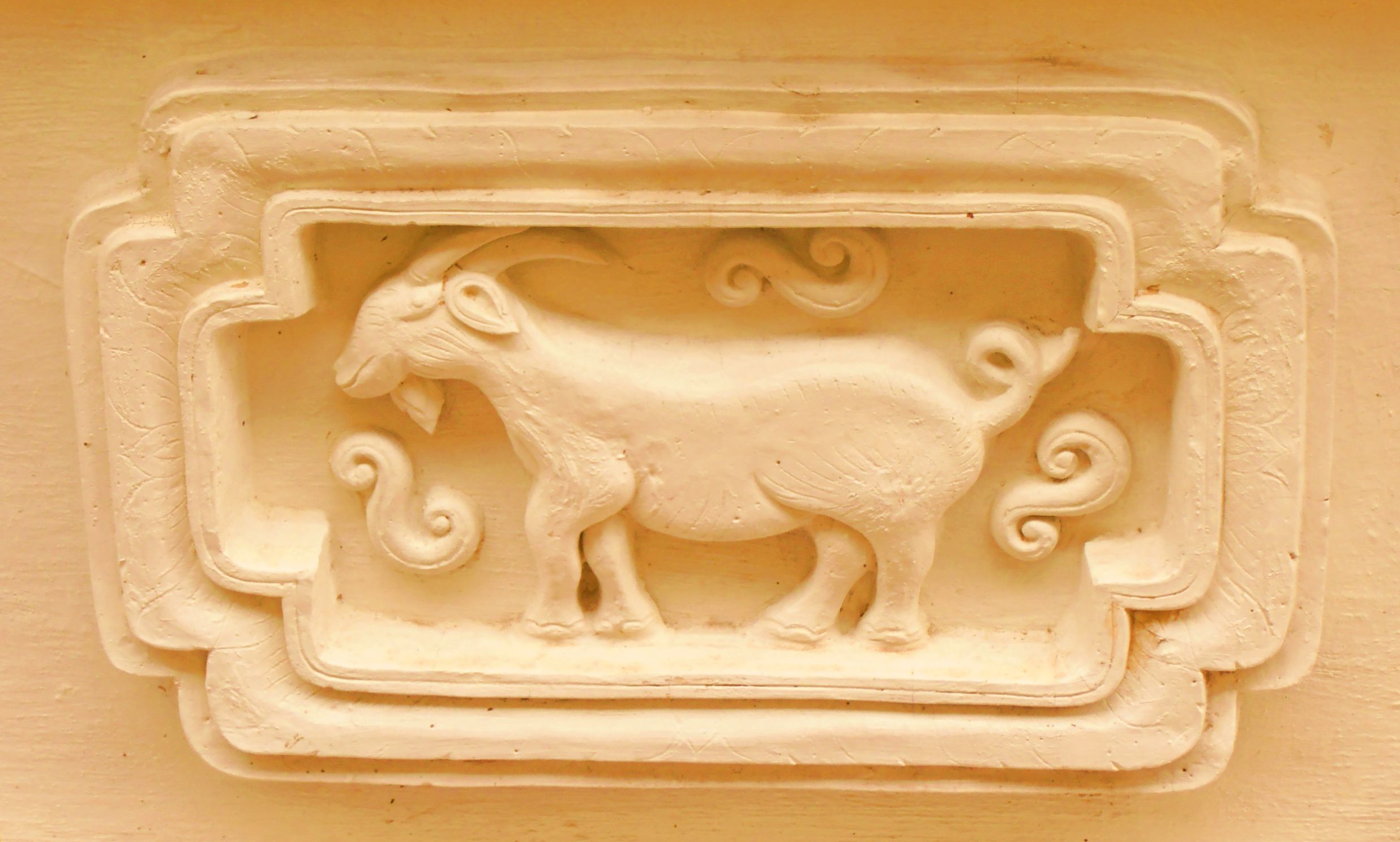
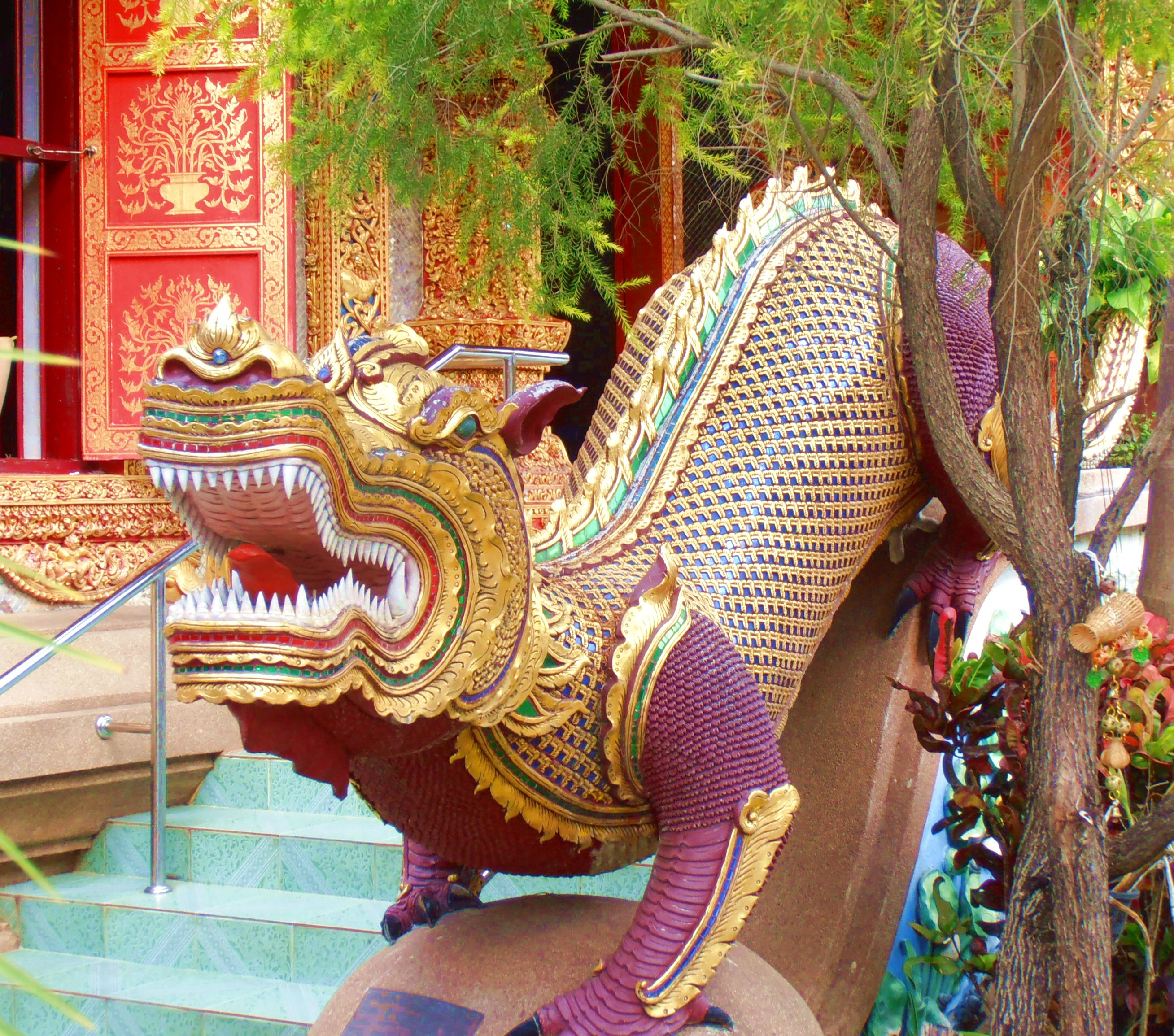
Nagas (info here) and lions form a large proportion of the free-standing sculptural elements in a Thai wat. They present a bewildering variety of forms, all iconographically significant, I’m quite sure, but it’s lost on me, unfortunately. I delight chiefly in the sculptural inventiveness and the fine detail of those available for inspection at close range. The naga is based on the king cobra, but Thai nagas often look like they transmogrified along the way and became dragons of a mildly Chinese persuasion, like the first two photos in Row 1. The two pieces in cream-colored stucco struck me as wonderful points of repose in the ornamental frenzy going on all about them, and the goat in the first pic of Row 2 looks like it’s straight from the Swiss Alps and should have a bell round its neck and Heidi beside it. Charming.
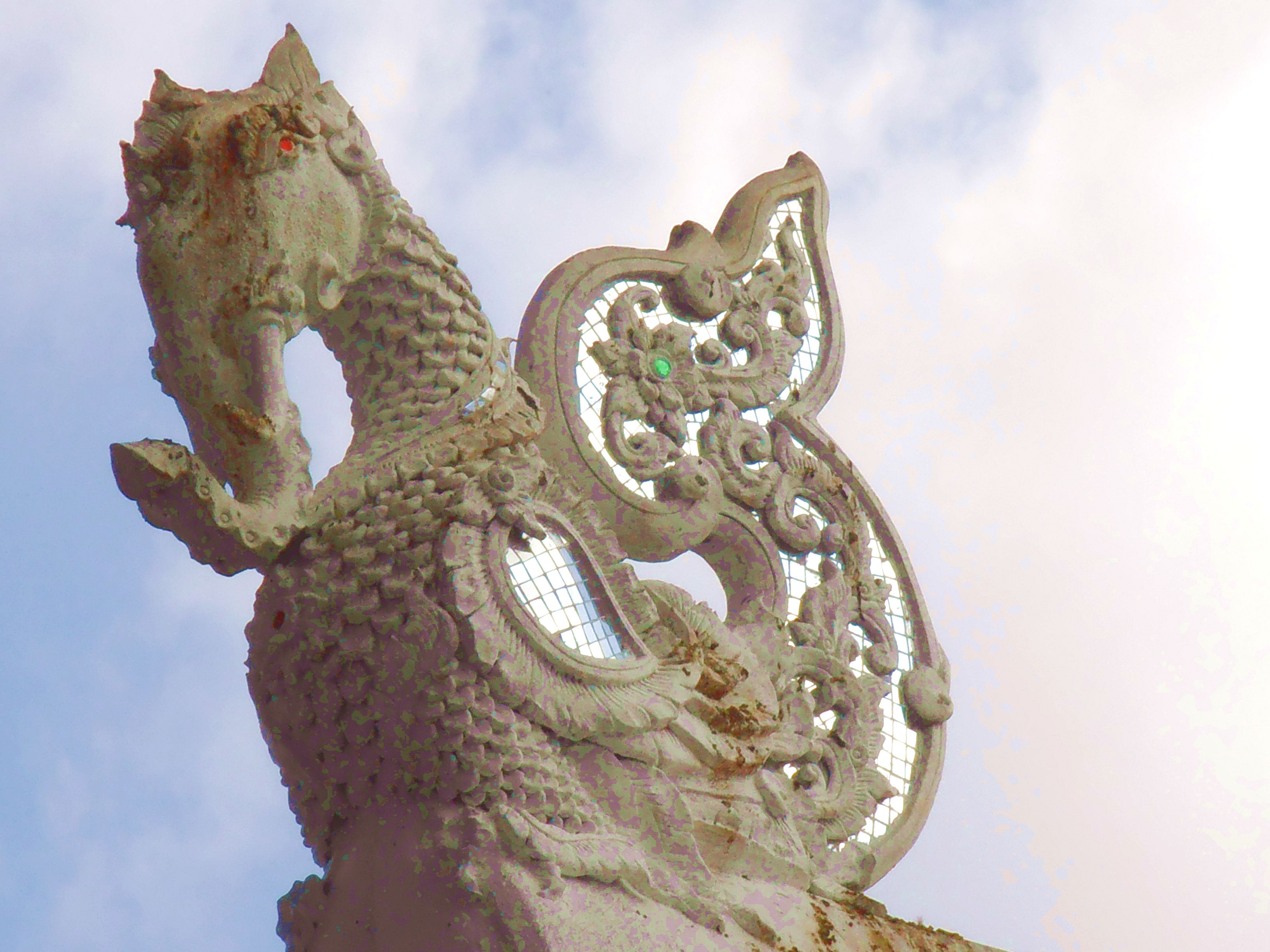
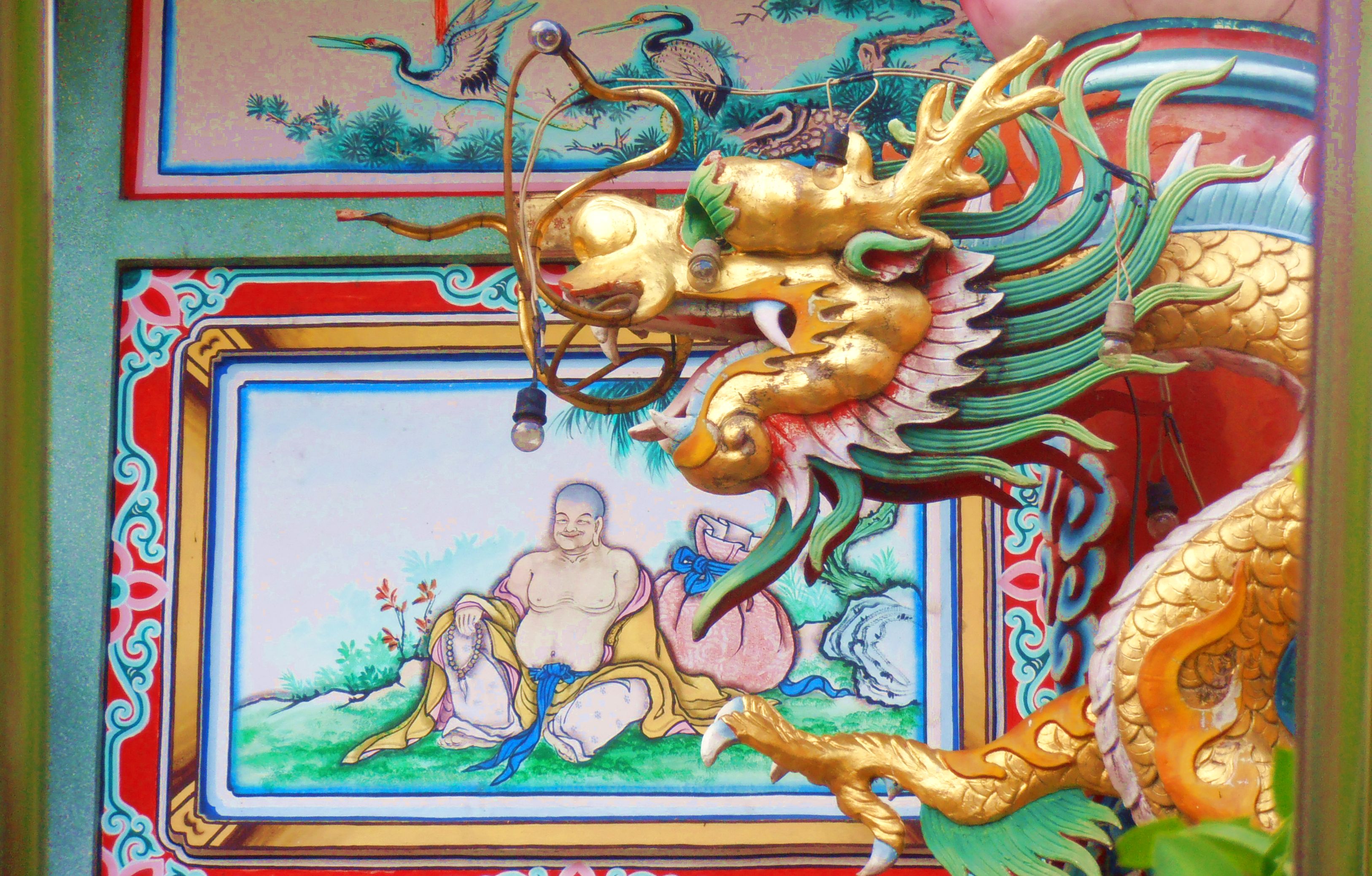
The creature in the second pic of Column 1 was an astonishing apparition when I first caught sight of it. Quite the set of choppers, you must admit — the mouths of protective deities are usually not quite that full and the teeth vary somewhat in size in a doff of the cap to anatomical versimilitude. None of that with this customer, however. Since it has legs, I assume it’s a dragon, and it puts me in mind of Smaug, although obviously on a much smaller scale. Beautifully executed, and you can stick your head into the mouth and have a look at the gullet if you like, to add a frisson of daring-do. The third pic of Column 3 is on a gable where one would expect to find a garuda (info here) stripped down to the essentials of form. I’m completely ignorant about the iconography of this fantastic beast, who seems to have sprung from the illustrations for Alice in Wonderland. The appeal with which it engages the eye through its liveliness of line is enough to satisfy me for the moment, I’ll get back to you on the iconography, cheers bud.
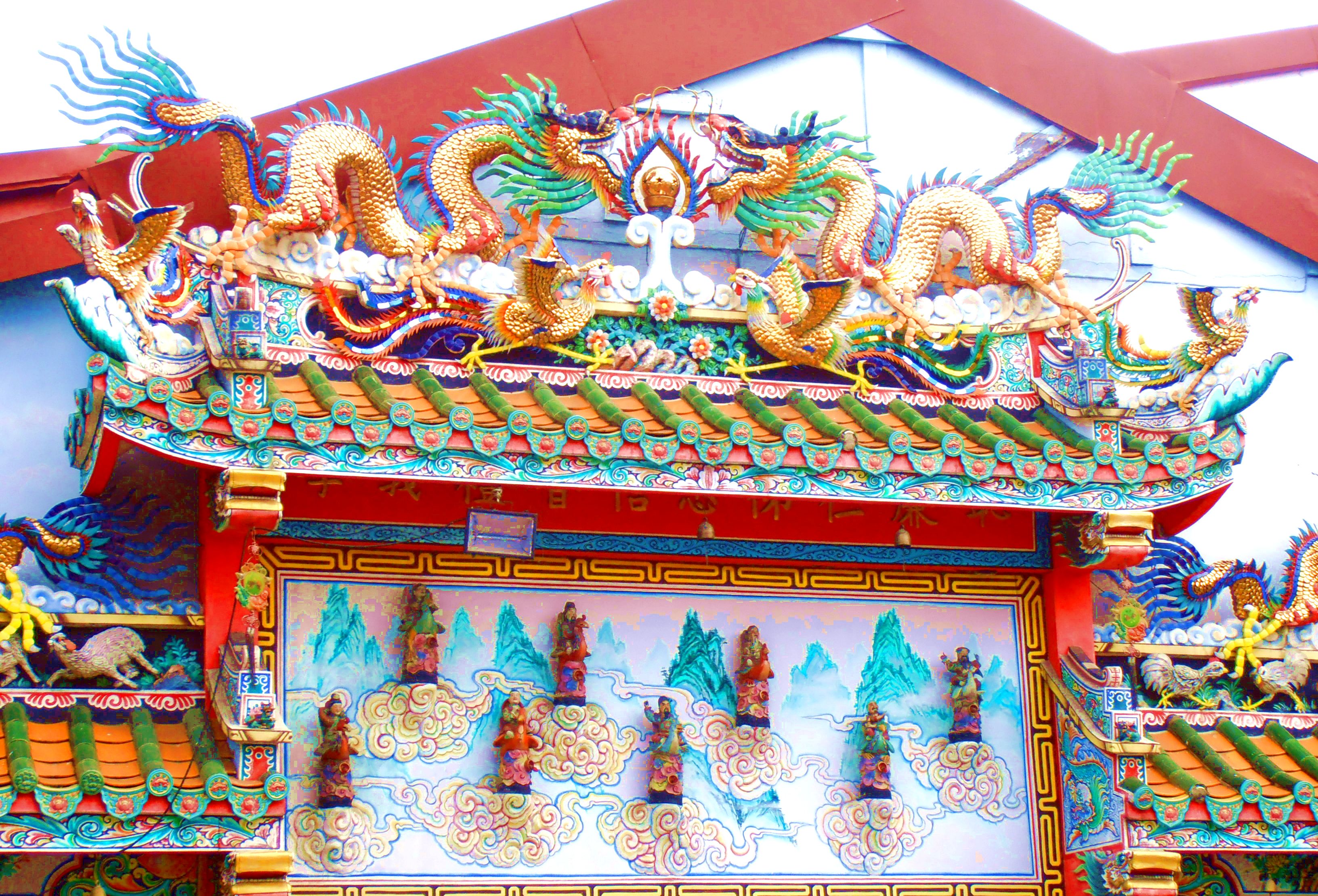
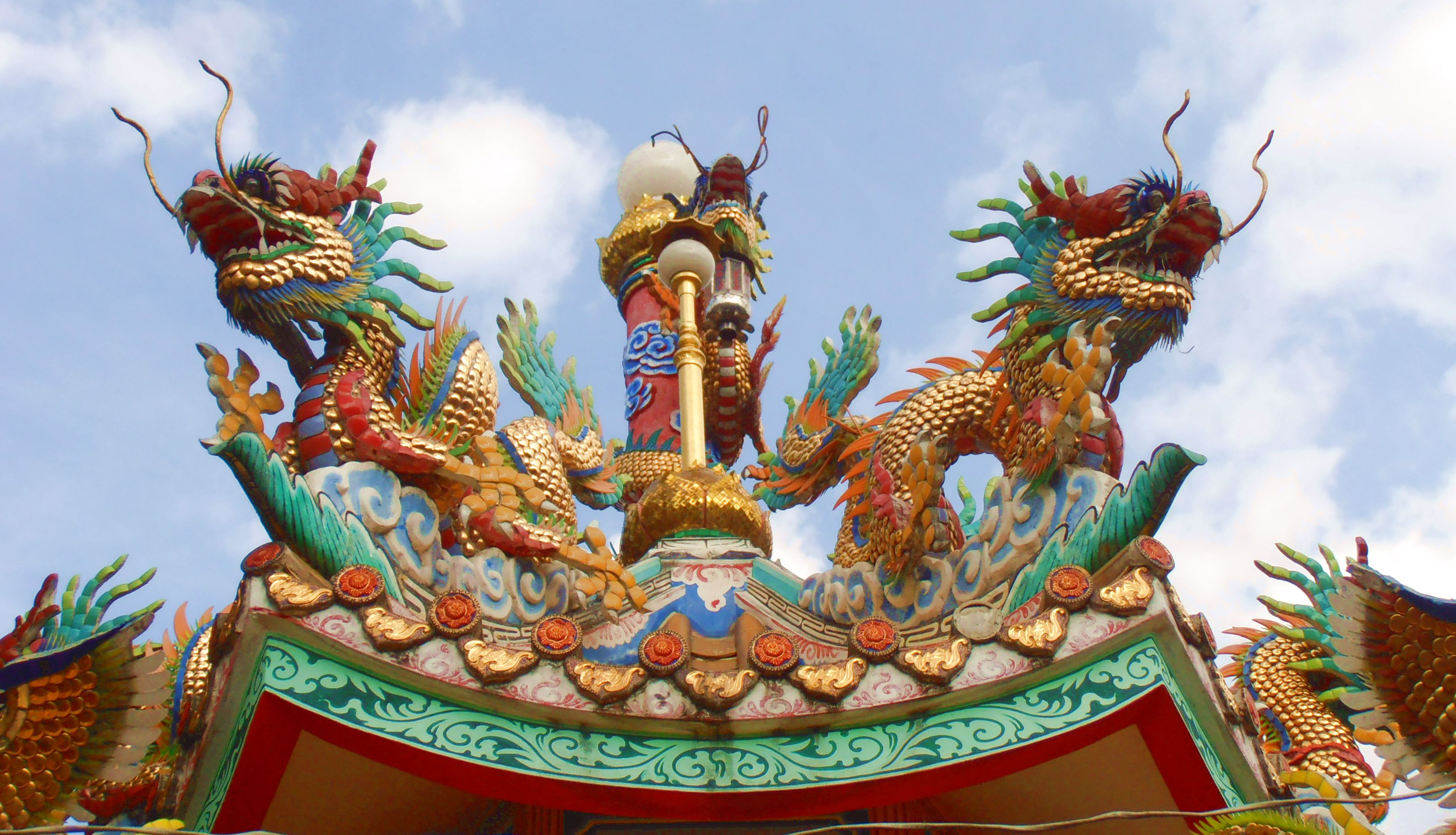
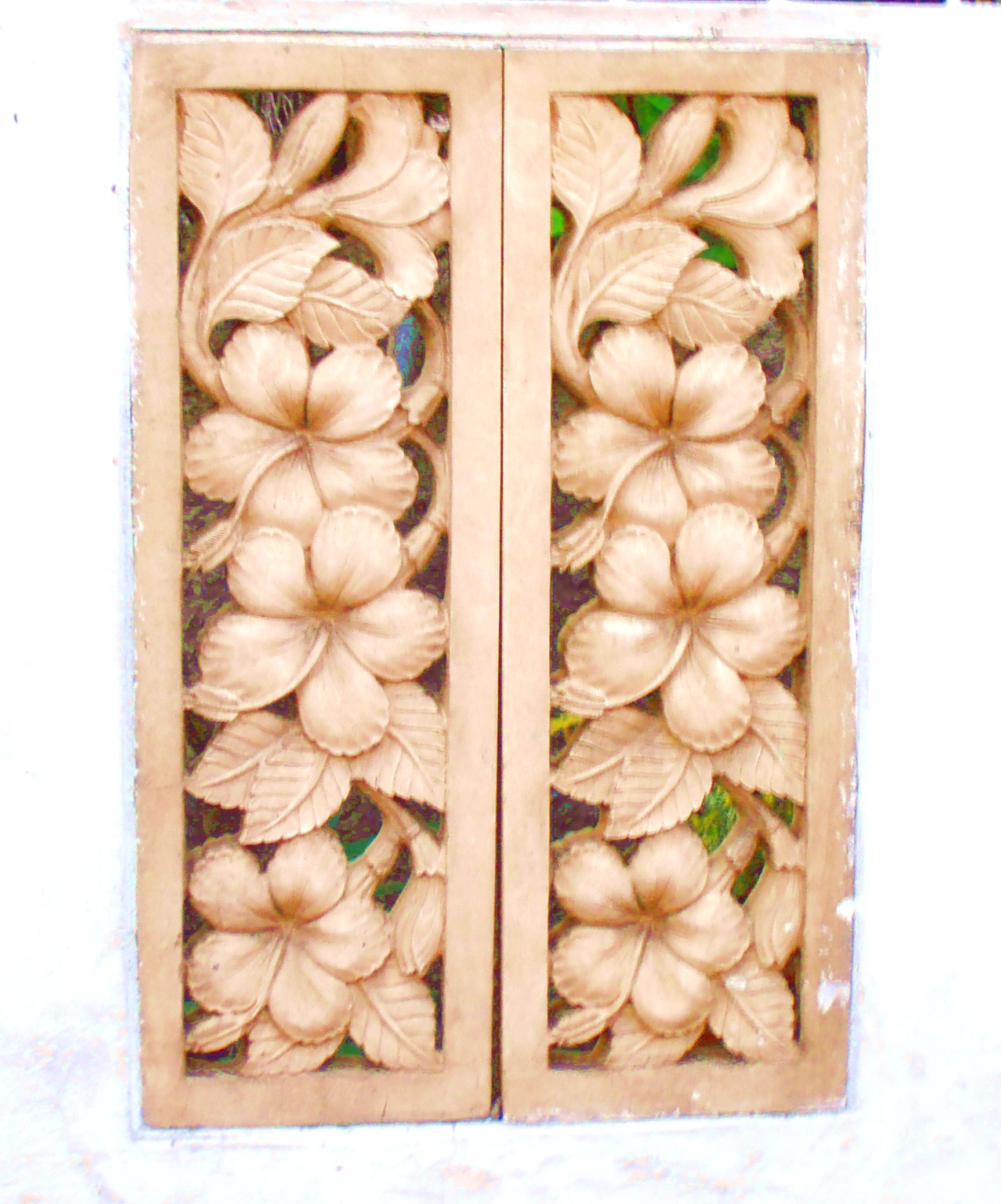
The last two pics of Column and the last of Columns 2 and 3 are not from a wat, they come from a Chinese temple beside the Wararot Market (the main public market) in what is called Chiang Mai’s Chinatown. It’s interesting to compare Thai and Chinese aesthetic agendas, each with their own loveliness but so different from each other. The dragon in the middle pic of Row 3 is clearly a dragon — you don’t need to wonder what you’re looking at, since dragons are the stars of Chinese iconography. Chinese color schemes look positively technicolor compared to those of Thai temples. No matter how riotous ornament becomes in Thai art, it never becomes flamboyant in the way Chinese art does, in my opinion. The monochrome panel of hibiscus flowers is also Chinese, however, and quite lovely in its monochromatic simplicity. So the pendulum can swing both ways in Chinese art, just as it can in Thai art. All of these things are lovely so the more the merrier, that’s my vote — my eye is insatiable for all of it.
Architectural Elements
Different elements of the architectural ensemble of a temple can be taken on their own merit aesthetically, I find, so this section deals with shots of building parts I found particularly appealing. I let the photos make their own case:
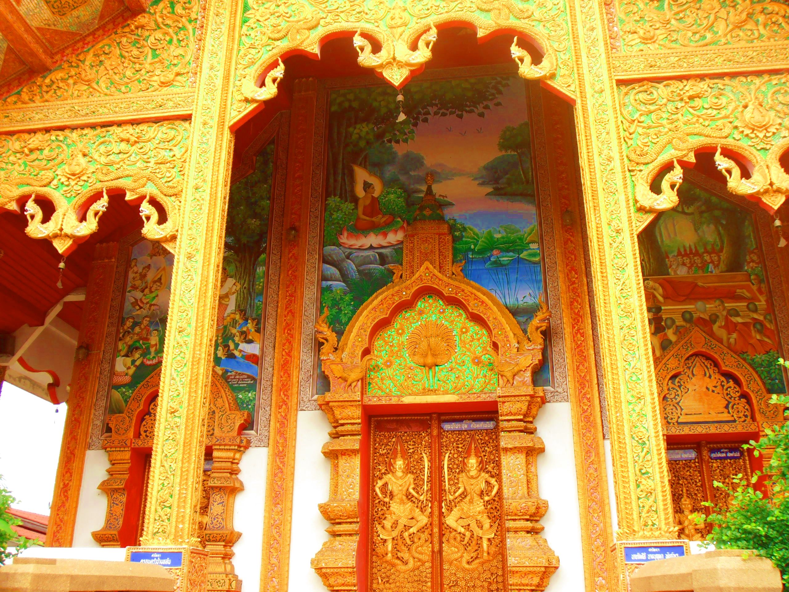
As you can see, porches figure largely. They usually receive exceptional care in their ornamentation, to the point that I’m always tempted to dawdle a good while before entering the building (usually a vihara).
The first pic in Column 1 shows something that surprised me: a painting in a porch. I don’t think I’ve seen one anywhere else, and it’s lovely. The colors work wonderfully even in their shady retreat and contrast beautifully with the gold filigree surrounding them.
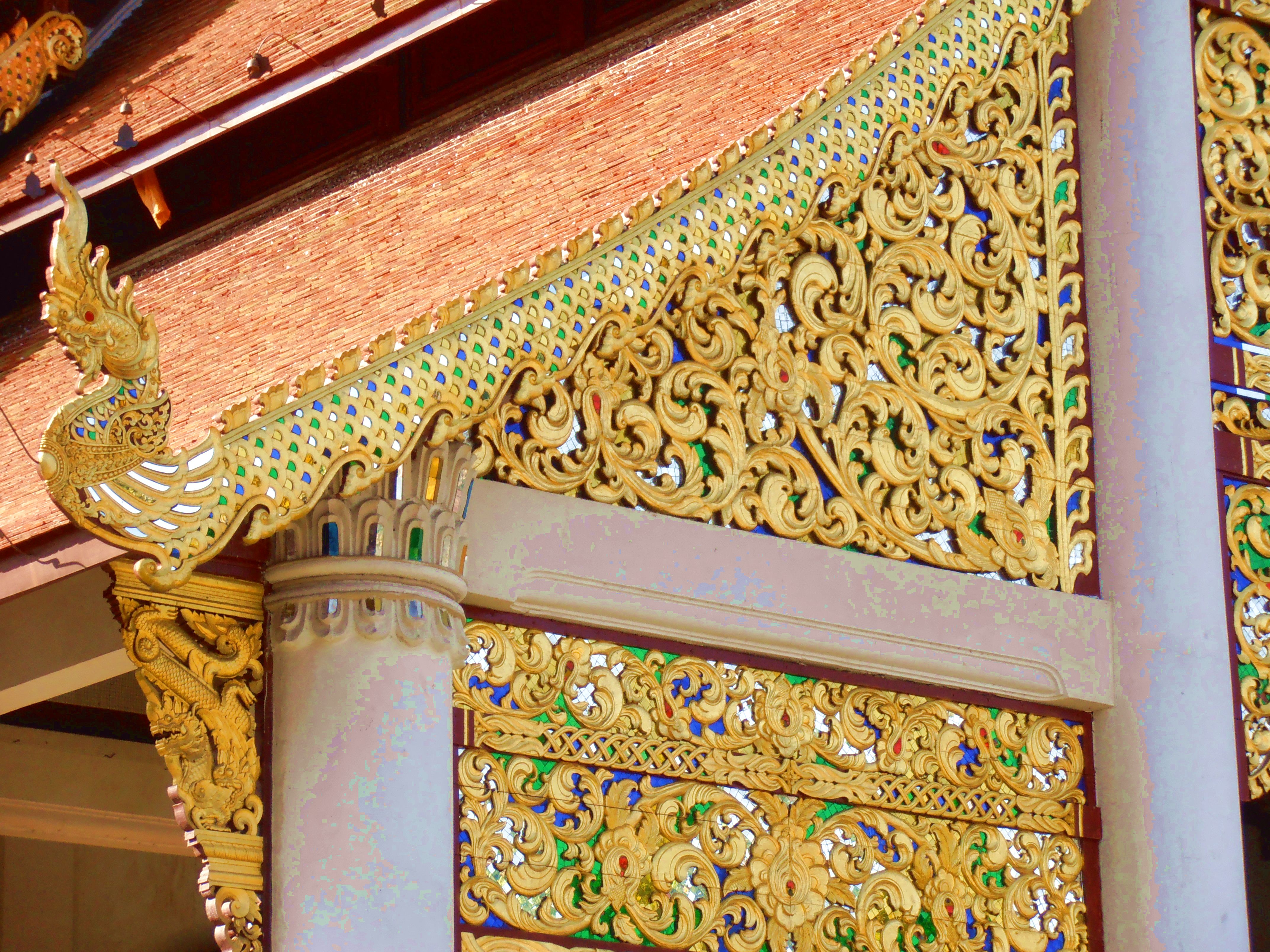
If I were to choose a Thai style element worthy of comparison with the Sicilian Baroque, it’s the element in the first pic of Column 2 on the underside of a roof. The use of glass tiles is a very popular decorative technique in temple architecture, but it’s easy to take it over the top. Once in a while you find yourself standing on the edge of that cliff, as happens in this case, I think. But it’s fun to cut loose once in a while and throw restraint to the winds, so it’s all good.
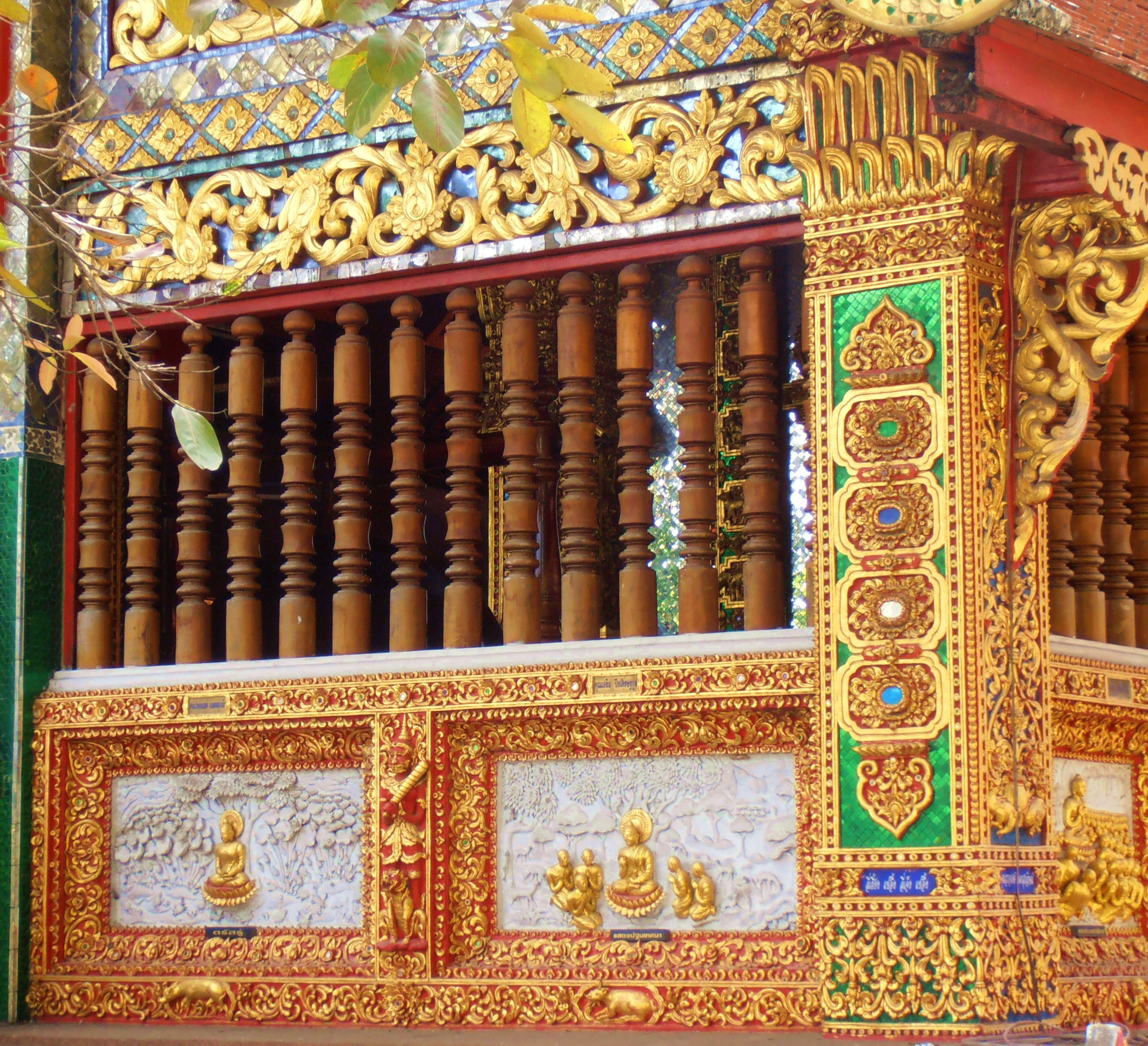
The first pic in Column 3 shows the use of wood combined with the stucco elements to beautiful effect. The vihara of Wat Lok Mollee just outside the northwest corner of the Old City is built entirely of carved teak wood, the only example of an entirely wooden temple I’ve seen. Usually carved wooden elements in their native surface state are ornamental accents, like these window slats. It works both ways, to be honest. You obviously can’t have too much teak in a decorative scheme, and even a little adds a lot.
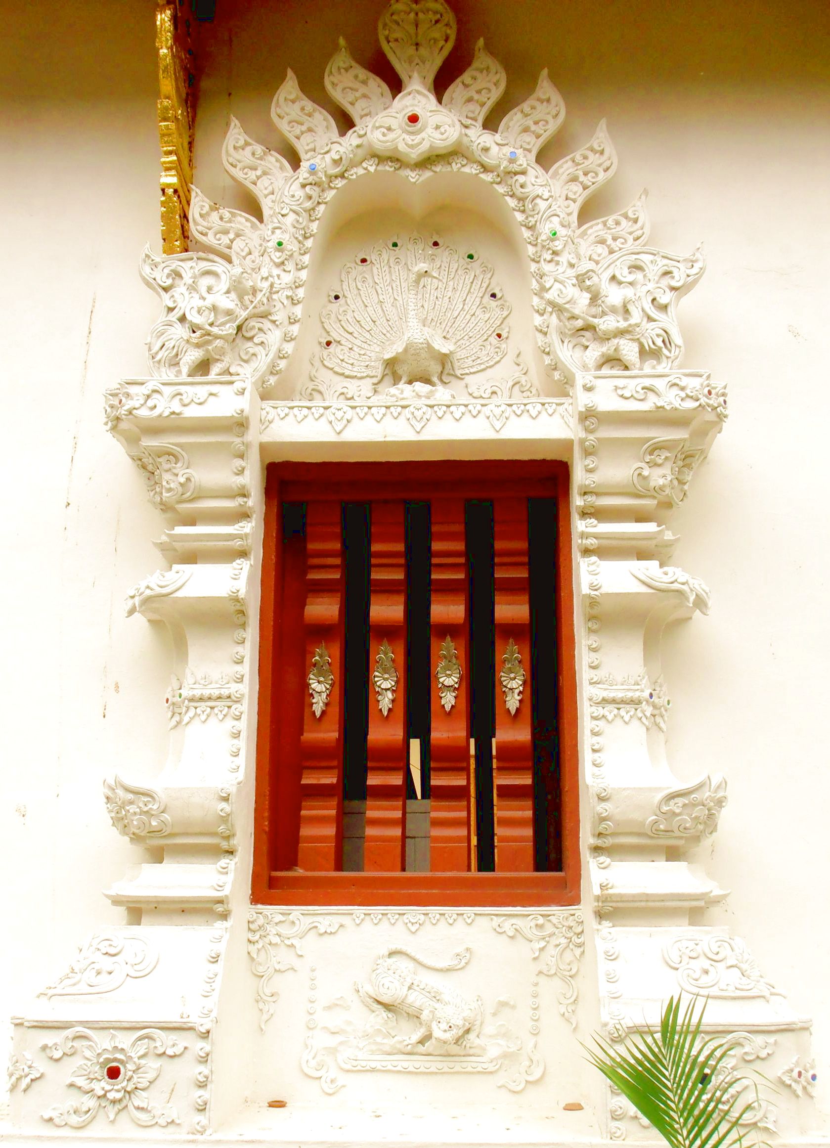
The last pic in Column 3 shows another example of teak slats used in a window composition. The stunner for me is the white stucco work. I have a weakness for textured compositions in white, don’t ask me why, and I stood a good while before this one drinking in the loveliness of the forms. “It’s just a window,” I can hear some people saying. Yes, but what a window. There’s enough craft and art in it to keep you busy for hours. What a delight.
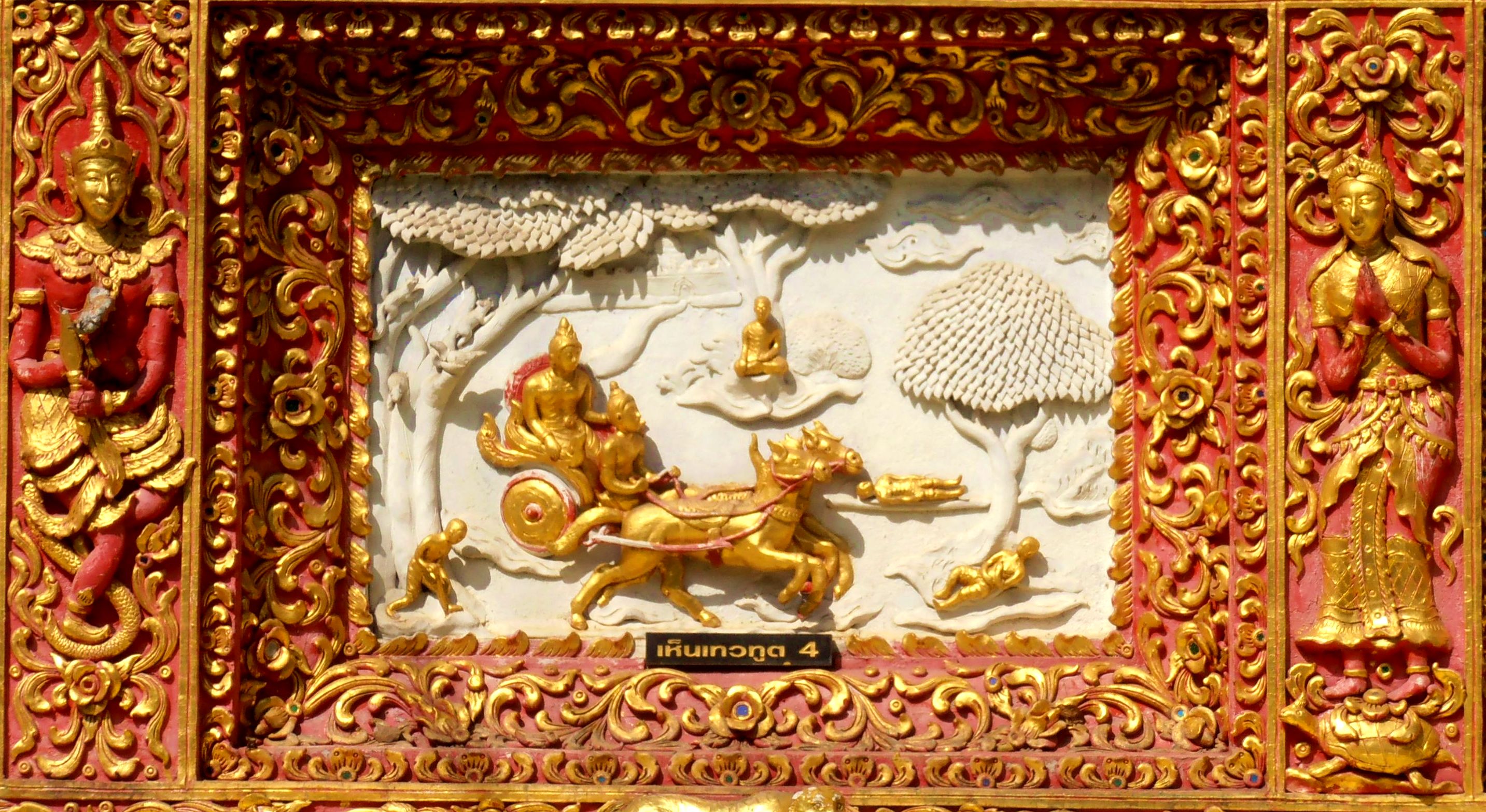
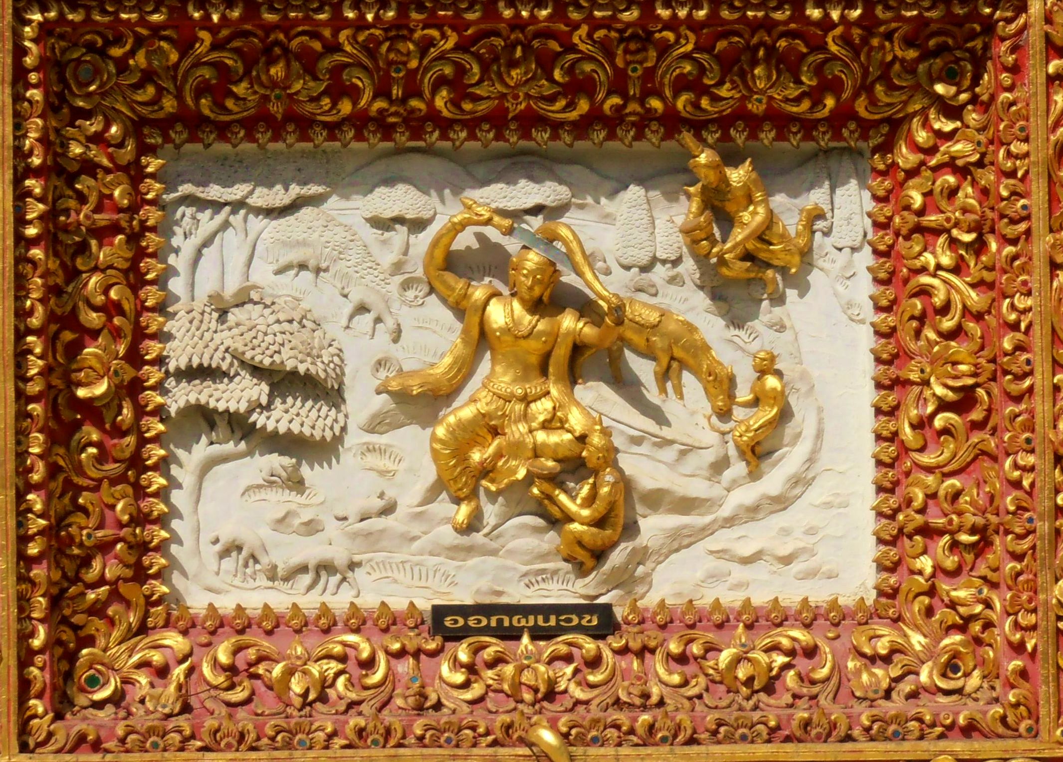
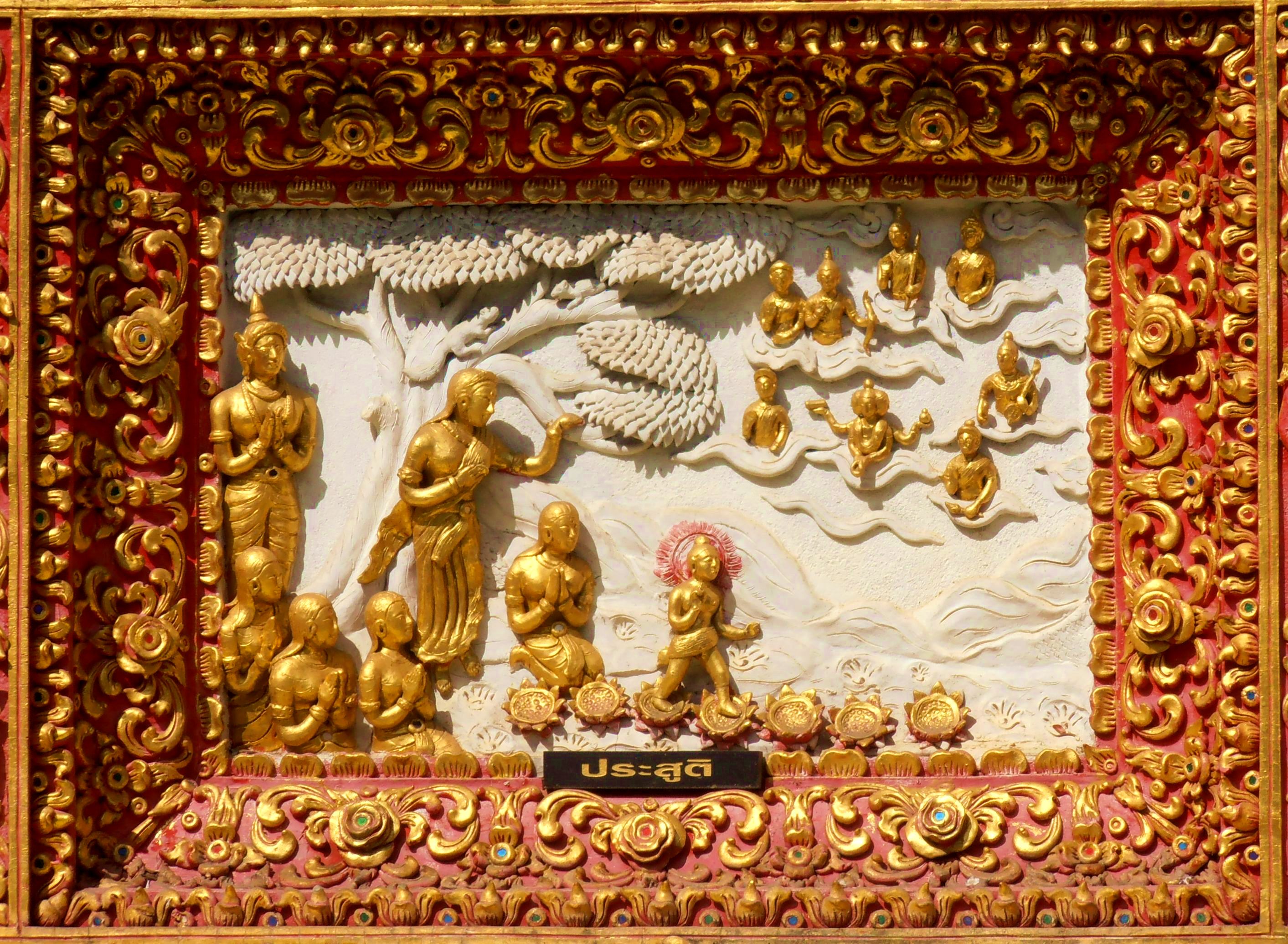
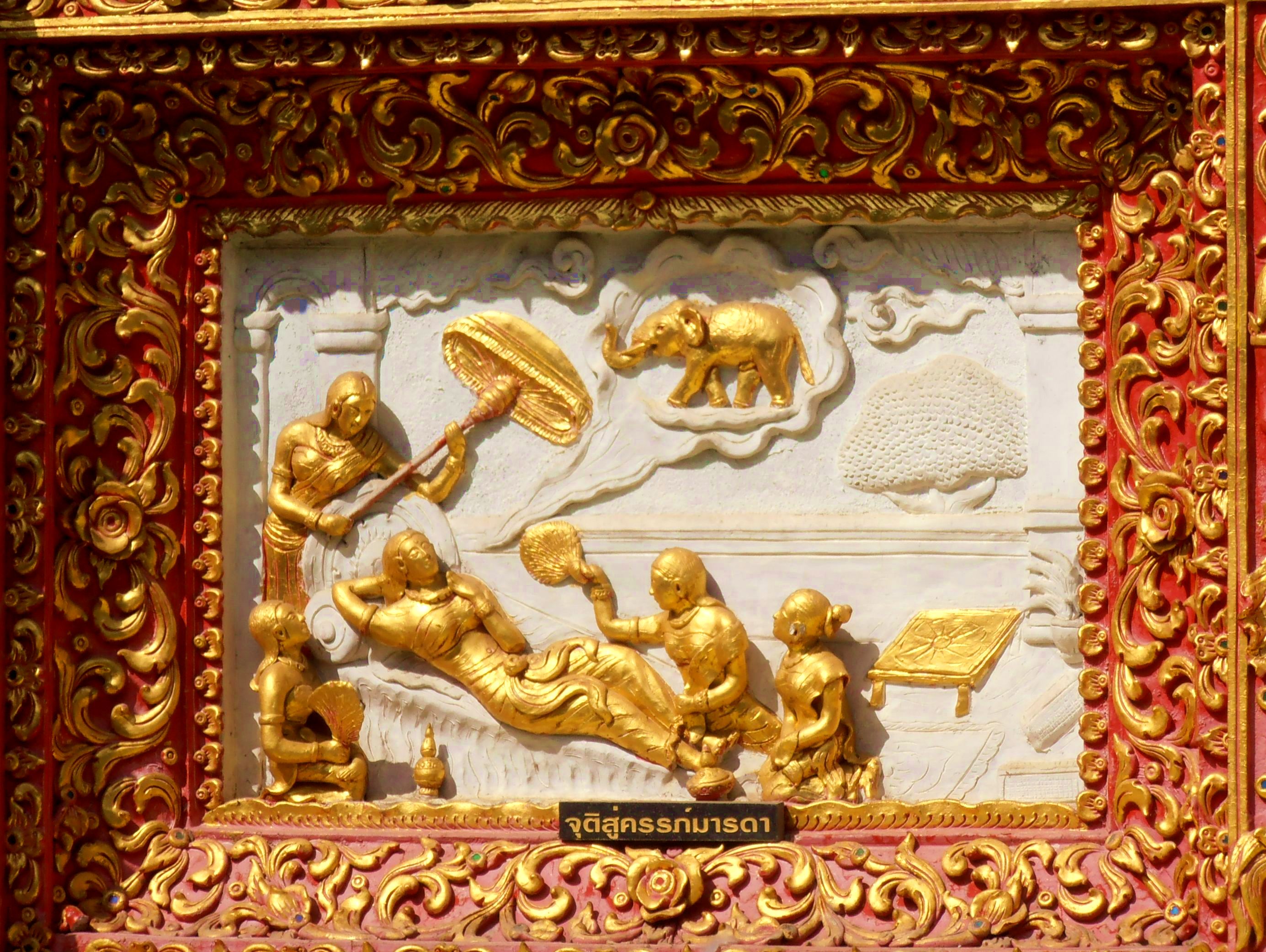
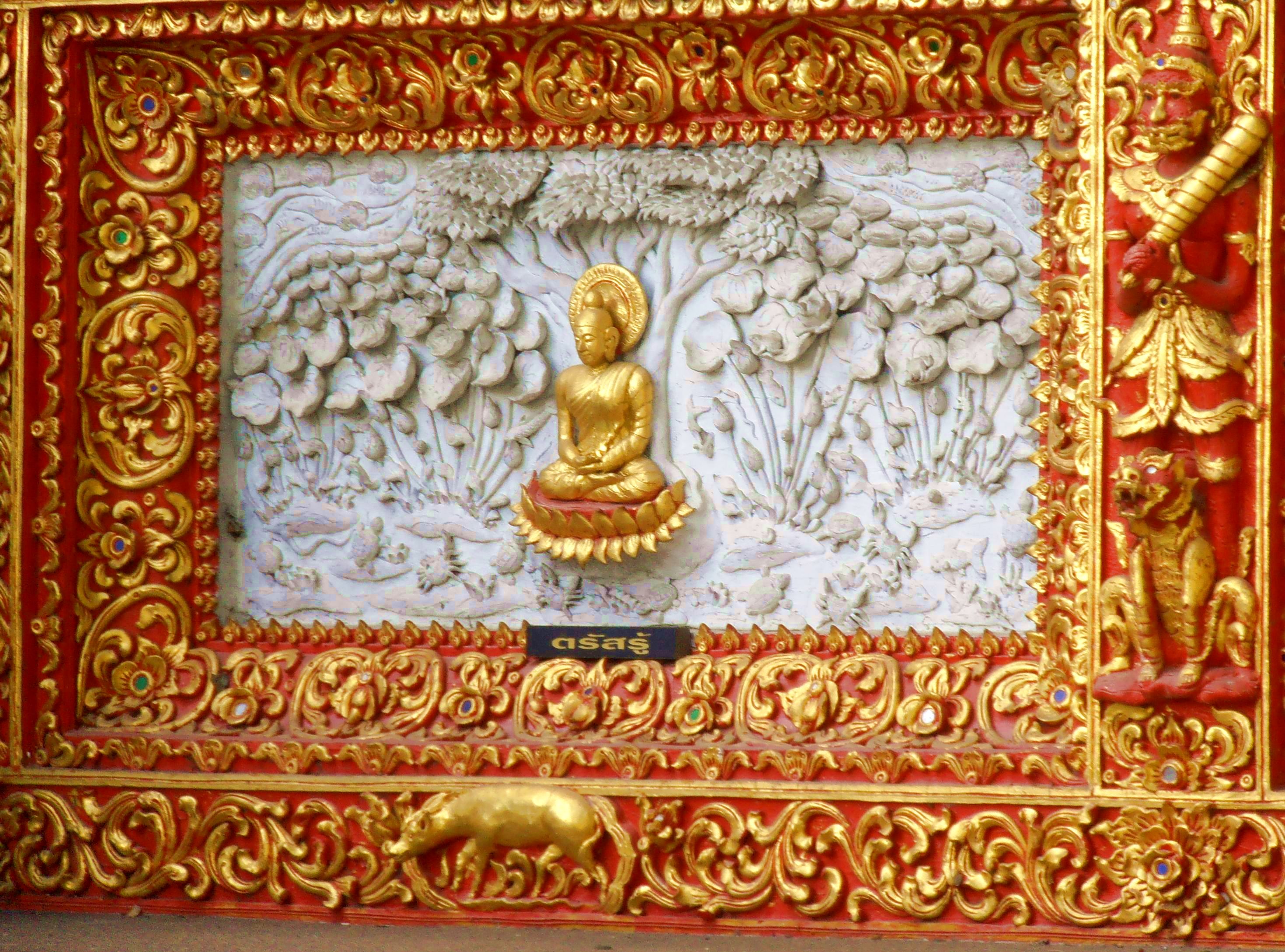
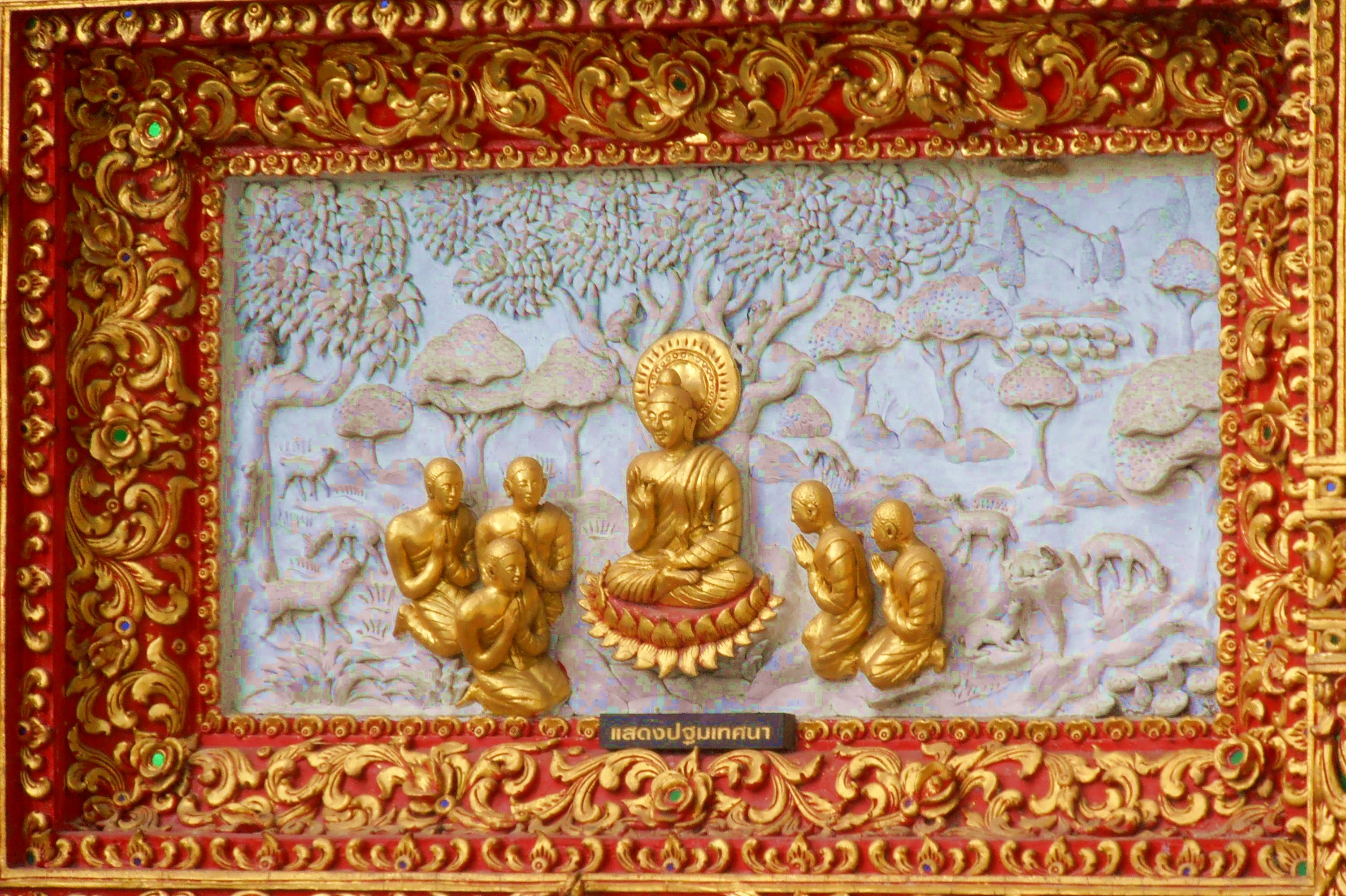
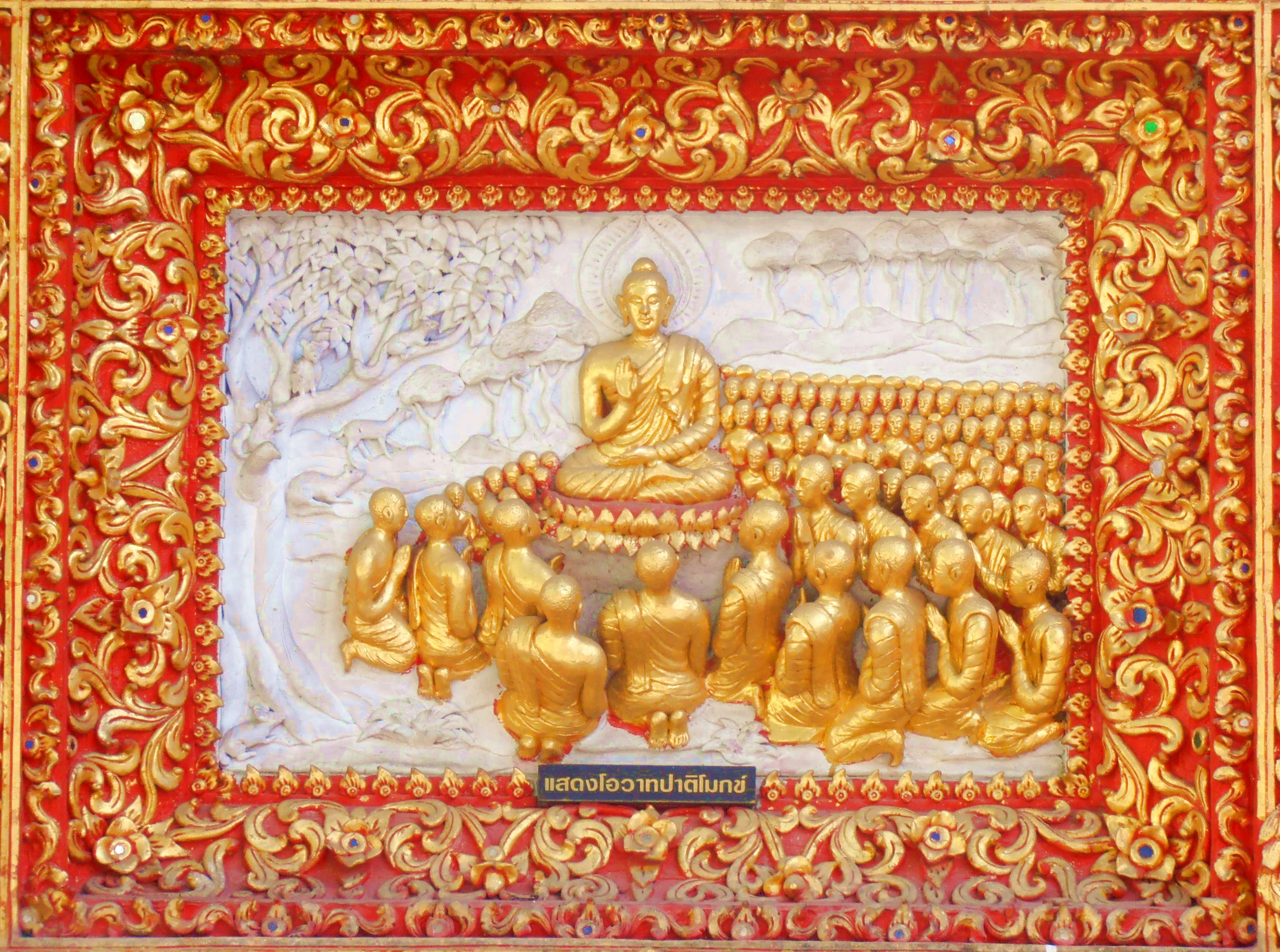
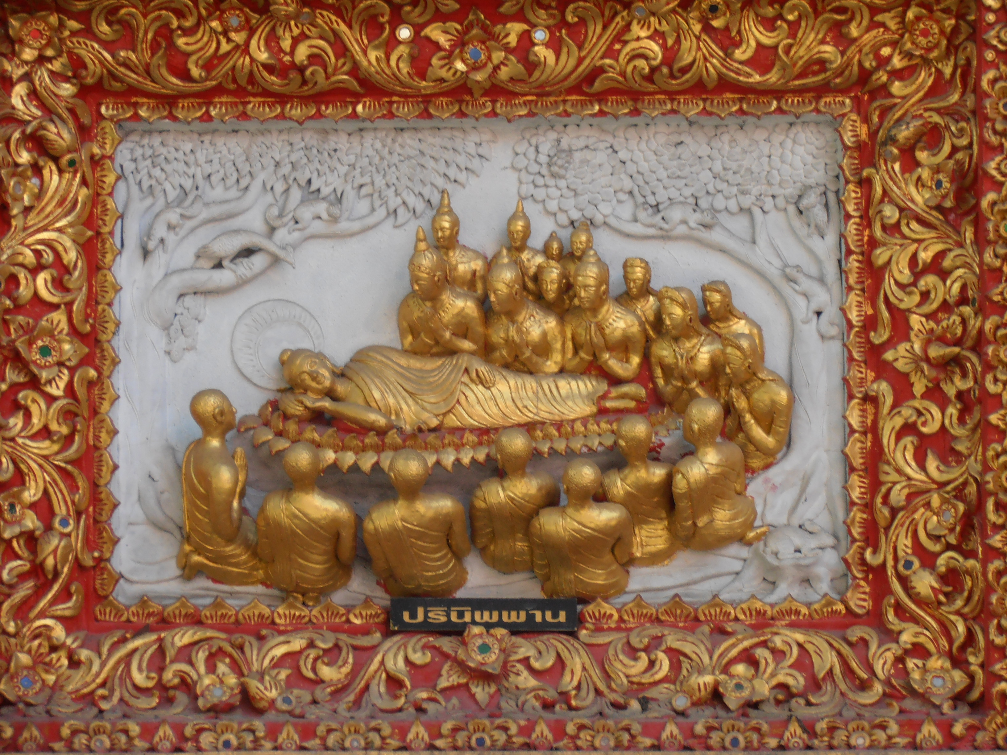
If you look at the first pic in Column 3 you’ll see that it has panels around the base of the porch. It’s a good thing I swore off the tour guide approach at the beginning of this post, because had I taken on that role I’d surely have the shade of Nikolaus Pevsner tossing in his grave at this juncture. I can’t remember what temple this is, to be honest. 🙁 But no matter, it’s there and you’ll come across it eventually. As the last section of this exploration I want to focus on that set of panels. They’re extraordinary not only from an artistic viewpoint but because of their rarity. They’re the closest thing I’ve seen to the kind of narrative you find in fresco or sculpture cycles in European religious art. They are exquisitely wrought. Let’s have a look:
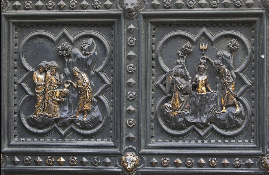
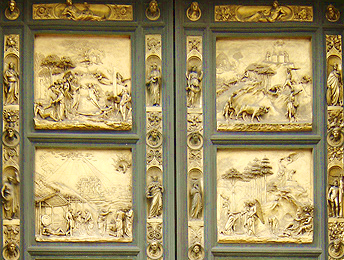
What we have before us is a cycle on the life of Buddha, the scenes represented in each panel are easily decipherable for anyone who knows the Buddha’s life story. Such a cycle in bas-relief sculpture brings immediately to my mind an analogue in western art: the doors of the Baptistry in Florence (Wikipedia page here). Look at the similarity — the first image is of panels by Andrea Pisano and the second a detail from the famous works by Lorenzo Ghiberti:
The parallels are immediately obvious. Once again we need to factor into our view that Thai art does not use linear perspective in the way western art does. You can see that stylistic shift in Renaissance art even in the difference between Pisano’s panels and those of Ghiberti, who was a contemporary (indeed, a rival) of Filippo Brunelleschi, the artist who rediscovered linear perspective and put that cat among the pigeons of Renaissance artists throughout Italy. Here’s a detail of one of Ghiberti’s compositions:
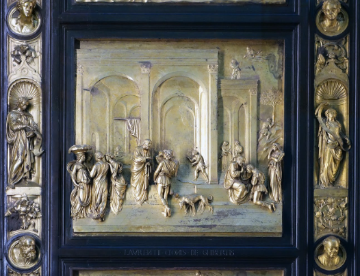 Linear perspective brings to Ghiberti’s composition an additional dimension of space so that the composition acts in three dimensions, not just in two. The effects are stunning, of course, and those of us raised on western art recognize in works such as these of Ghiberti artistic merit of the first order. They’re legitimately treasured as masterpieces.
When we consider the panels from the Chiang Mai temple, I think it safe to say that comparison with the panels of Pisano and Ghiberti puts them at no aesthetic disadvantage. The lack of linear perspective in the compositions has simply to be bracketed out because it isn’t part of Thai aesthetic tradition. If we consider the composition of the panels purely from the standpoint of figures in space, it’s really very well done. I avoid comparisons of quality in works of art, “better than” and “less than” seem in such matters to make no sense. The point that interests me in comparing the Thai panels to the doors of the Baptistry in Florence is wonderment at the similarity of the aesthetic vehicle in two cultures separated by a great span of time and half a world. I have no idea from what historical period the Thai panels date, to be perfectly honest. The traditions and iconographic repertoire of Thai religious art don’t change much, so you can find a work done 20 years ago that could easily fool you into thinking it dates from the 16th century. Western art, on the other hand, can easily be localized in its historical period. So let’s set aside history and traditions and just revel in two remarkably similar accomplishments of great merit, each with its own special qualities, and be pleased that human beings in such different times and places can be equally clever in providing for us things to delight the eye.
I hope this show-and-tell has whetted your appetite to become your own detail sleuth should you visit the temples of Chiang Mai’s Old City. I’ve barely scratched the surface, no doubt about that. You’ll find your own delights if you do as I’ve done, and when next I’m in the Old City I’ll submit once again to Agassiz’ directive: “Look, look, look!”

